3

I have a table of ranked data that I'd like to visualise as a bump chart or a slope chart, e.g.
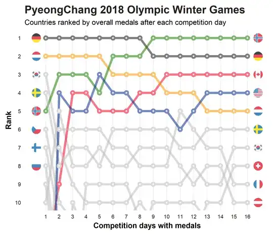
I have an idea of how to plot one, but if there's one thing I've learnt about pandas it's that there's usually some combination of melting, merging, foaming and fiddling that'll do the job in a one liner. AKA elegant pandas, not scrambling pandas.

The data looks a bit like this: (much more data here)

ed_name source
2562 edition_3 gq
2956 edition_8 warontherocks
10168 edition_12 aeon.co
1137 edition_14 hbr.org
4573 edition_13 thesmartnik
7143 edition_16 vijayboyapati.medium
9674 edition_15 medium
5555 edition_9 smh.au
8831 edition_11 salon
8215 edition_14 thegospelcoalition.org

and so on, where each row is an article, and the source is the place where that article came from. The goal is to find out, per edition, which sources contribute the most articles.

Here's my attempt to clumsily convert it to a bad bump chart:

all_sources = set(sources)
source_rankings = {}
for s in all_sources:
    source_rankings[s]={}

for ed in printed.groupby("ed_name"):
    df = ed[1]
    vc = df.source.value_counts()
    for i, x in enumerate(vc.index):
        source_rankings[x][ed[0]] = i+1
ranks = pd.DataFrame(source_rankings)

cols_to_drop = []
for name, values in ranks.iteritems():
    interesting = any([x>30 for x in list(values) if not math.isnan(x)])
    # print(name, interesting)
    if interesting:
        cols_to_drop.append(name)
only_interesting = ranks.drop(labels=cols_to_drop, axis='columns')

only_interesting.sort_index(
    axis=0, inplace=True, 
    key=lambda col: [int(x.split("_")[1]) for x in col],
    ascending=False
    )

linestyles = ['-', '--', '-.', ':']

plt.plot(only_interesting, alpha=0.8, linewidth=1)
plt.ylim(25, 0)
plt.gca().invert_xaxis()
plt.xticks(rotation=70)
plt.title("Popularity of publisher by edition")

editions_that_rank_threshold = 10
for name, values in only_interesting.iteritems():
    if len(values[values.isna() == False]) > editions_that_rank_threshold: 
        for i, x in values.iteritems():
            if not math.isnan(x):
                # print(name, i, x)
                plt.annotate(xy=(i,x), text=name)
                plt.plot(values, linewidth=5, linestyle=sample(linestyles,1)[0])
                break

plt.xlabel("Edition")
plt.ylabel("Cardinal Rank (1 at the top)")
plt.close()

Which gives something like:

enter image description here

Which, to say the least, leaves a lot to be desired. A lot of that can be solved by grinding away with standard matplotlib things, but I'm hesitant to do that as it feels inelegant, and there's probably a built in bumpchart method that I'm missing.

This question asks a similar question, but the answer solves it as a slope chart. They look great, but that's a different type of chart.

Is there a more elegant way to do this?

Ben
  • 12,614
  • 4
  • 37
  • 69
  • 1
    There is a function to draw a [bump chart](https://mplsoccer.readthedocs.io/en/latest/gallery/bumpy_charts/plot_bumpy.html#sphx-glr-gallery-bumpy-charts-plot-bumpy-py) in the mplsoccer library. I hope this will be of some help. – r-beginners Jun 24 '21 at 13:14

2 Answers2

4

I don't think you are missing some built in method. I'm not sure how suited your data is to a bump chart because the edition-to-edition variations seems quite large and several sources seem to have equal rank, but here is my attempt for a bit of fun.

Reading/ranking the data

import pandas as pd

data_source = (
    "https://gist.githubusercontent.com/"
    "notionparallax/7ada7b733216001962dbaa789e246a67/raw/"
    "6d306b5d928b04a5a2395469694acdd8af3cbafb/example.csv"
)

df = (
    pd.read_csv(data_source, index_col=0)
    .assign(ed_name=lambda x: x["ed_name"].str.extract(r"(\d+)").astype(int))
    .value_counts(["ed_name", "source"])
    .groupby("ed_name")
    .rank("first", ascending=False)
    .rename("rank")
    .sort_index()
    .reset_index()
    .query("ed_name < 17")
)

Here I chose to rank by "first" as this will give us exclusive ranks rather than overlapping ranks. It makes the plot look slightly nicer, but might not be what you want. Use "min" instead of first if you want overlapping ranks.

Get the n top ranked of last edition (for labelling)

n_top_ranked = 10
top_sources = df[df["ed_name"] == df["ed_name"].max()].nsmallest(n_top_ranked, "rank")

Simple plot

import matplotlib.pyplot as plt
for i, j in df.groupby("source"):
    plt.plot("ed_name", "rank", "o-", data=j, mfc="w")
plt.ylim(0.5, 0.5 + n_top_ranked)
plt.gca().invert_yaxis()

The resulting plot here isn't so nice, but it is simple to make.

enter image description here

Make the plot a bit nicer

import matplotlib.pyplot as plt
from matplotlib.ticker import MultipleLocator, FixedFormatter, FixedLocator

fig, ax = plt.subplots(figsize=(8, 5), subplot_kw=dict(ylim=(0.5, 0.5 + n_top_ranked)))

ax.xaxis.set_major_locator(MultipleLocator(1))
ax.yaxis.set_major_locator(MultipleLocator(1))

yax2 = ax.secondary_yaxis("right")
yax2.yaxis.set_major_locator(FixedLocator(top_sources["rank"].to_list()))
yax2.yaxis.set_major_formatter(FixedFormatter(top_sources["source"].to_list()))

for i, j in df.groupby("source"):
    ax.plot("ed_name", "rank", "o-", data=j, mfc="w")

ax.invert_yaxis()
ax.set(xlabel="Edition", ylabel="Rank", title="Popularity of publisher by edition")
ax.grid(axis="x")
plt.tight_layout()

Which gives you the following enter image description here

There is still work to do here to get this looking really nice (e.g. the colours need sorting) but hopefully something from this answer gets you closer to your goal.

tomjn
  • 5,100
  • 1
  • 9
  • 24
4

There is also a very useful GitHub repository https://github.com/kartikay-bagla/bump-plot-python

It is basically one class which allows you to plot Bump chart from pd.DataFrame.

data = {"A":[1,2,1,3],"B":[2,1,3,2],"C":[3,3,2,1]}
df = pd.DataFrame(data, index=['step_1','step_2','step_3','step_4'])

plt.figure(figsize=(10, 5))
bumpchart(df, show_rank_axis= True, scatter= True, holes= False,
          line_args= {"linewidth": 5, "alpha": 0.5}, scatter_args= {"s": 100, "alpha": 0.8}) ## bump chart class with nice examples can be found on github
plt.show()

bump chart example

Disclaimer. I am not the creator of the repository, but I found that very helpful.

0ndre_
  • 3,577
  • 6
  • 26
  • 44