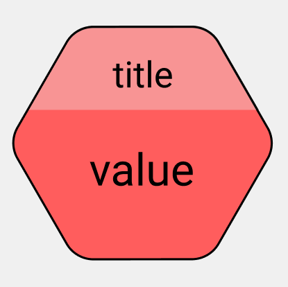
I am trying to make a hexagon with border radius, border and something like a mask. Something like this :
However, I am a bit stumped by the 'mask' and how I should go about making that shape. Would it be better to export this as svg than to make it with css3?
Currently I have this:
<div id="hexagon"></div>
#hexagon {
    position: relative;
    margin: 1em auto;
    width: 10.2em;
    height: 17.32em;
    border-radius: 1em/.5em;
    background: #FF5E5E;
    transition: opacity .5s;
    cursor: pointer;
    border-top: 2px solid black;
    border-bottom: 2px solid black;
}

#hexagon:before {
    position: absolute;
    width: inherit;
    height: inherit;
    border-radius: inherit;
    background: inherit;
    content: '';
    -webkit-transform: rotate(60deg);  /* Chrome, Opera 15+, Safari 3.1+ */
    -ms-transform: rotate(60deg);  /* IE 9 */
    transform: rotate(60deg); /* Firefox 16+, IE 10+, Opera */
    border-top: 2px solid black;
    border-bottom: 2px solid black;
}

#hexagon:after {
    position: absolute;
    width: inherit;
    height: inherit;
    border-radius: inherit;
    background: inherit;
    content: '';
    -webkit-transform: rotate(-60deg);  /* Chrome, Opera 15+, Safari 3.1+ */
    -ms-transform: rotate(-60deg);  /* IE 9 */
    transform: rotate(-60deg); /* Firefox 16+, IE 10+, Opera */
    border-top: 2px solid black;
    border-bottom: 2px solid black;
}
But even then this isnt very good since it looks a little off at the corners:
