How could I make the edit/delete component, which would hover when the user presses the 3 dots icon on each item in my FlatList?
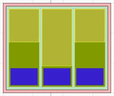
Just like in the image below:
How could I make the edit/delete component, which would hover when the user presses the 3 dots icon on each item in my FlatList?
Just like in the image below:
Like earlier comments suggest, you need an overlay that has some styling on it, such as style={{position:"absolute",top:0,right:0}}
But in order to show/hide the overlay you will need to toggle another class that controls a display: none style.
Perhaps this link will help
Essentially, you need to use React.useState to monitor whether or not the overlay should be visible, and the 3 dots button needs to toggle the state.
The state should be wrapped inside your Coupon component such that it is toggled for each item in your Array. I personally prefer using the .map(...) function when iterating over lists in React.
You can do like this.
import React,{useState} from 'react';
import { Text, View,StyleSheet,FlatList } from 'react-native';
const items = [
  { id: 1, name: 'imran' },
  { id: 2, name: 'shad' },
];
export default App = ({
    params,
}) => {
  const [visibleIndex,setVisibleIndex]=useState(-1)
  return (
    <View style={styles.container}>
      <FlatList
        data={items}
        renderItem={({ item, index }) => {
          return (
            <View style={styles.column}>
              <Text>{item.name}</Text>
              {visibleIndex === index ? (
                <View
                  style={styles.floatComponent}>
                  <Text style={styles.btn} onPress={() => console.log(index)}>Delete</Text>
                  <Text style={styles.btn} onPress={() => console.log('edit')}>Edit</Text>
                </View>
              ) : (
                <Text onPress={()=>{
                  console.log(index)
                  setVisibleIndex(index)
                  console.log({visibleIndex})
                }} style={[styles.floatComponent,{ fontSize: 30 }]}>...</Text>
              )}
            </View>
          );
        }}
      />
    </View>
  );}

const styles = StyleSheet.create({
  container: {
    flex: 1,
    justifyContent: 'center',
    paddingTop: 40,
    backgroundColor: '#ecf0f1',
    padding: 8,
  },
  column:{
     width: '100%', height: 70, backgroundColor: 'red',
     margin:5,justifyContent:"center",padding:10
  },
  floatComponent: {
    position: 'absolute',
    top: 0,
    right: 8,
    textAlign:"center",
    textAlignVertical:"center",
  },
  btn:{
    backgroundColor: 'blue',
    margin:1,
    padding:5
  }
});