I have a code generating power point presentations from weekly data. My table with row materials contain the material used in that week. Additionally I have a named vector with all the materials ever used and assigned colors to them. This ensures that Mat1 is always the same color weather or not it is used that week.
This is how it is programmed:
ggplot(df, aes(fill=Mat, y=pct, x=Date)) +
  geom_bar(position="fill", stat="identity")+
  scale_fill_manual(values = colors)
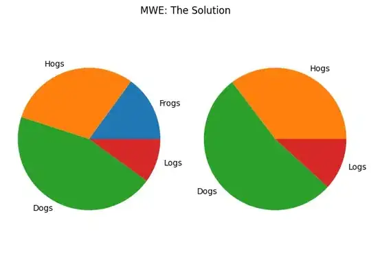
upto ggplot2 3.3.3 it was working fine. New 3.3.4 version changes the scale_xx_manual function which takes all the names from values and apply it to limits. This generates very long legend to the plot with all the possible color values even if only 3-4 are used that week.
I can go around it supplying
values = colors[unique(df$Mat)]
but that does not seem to be elegant solution.
Making use of the ggplot2::mpg dataset a minimal reproducible example of the issue:
library(ggplot2)
library(scales)

colors <- scales::hue_pal()(length(unique(mpg$class)))
colors <- setNames(colors, unique(mpg$class))

x <- subset(mpg, mpg$class %in% c("compact", "subcompact", "2seater"))

ggplot(x, aes(x = class, fill=class)) +
  geom_bar() +
  scale_fill_manual(values = colors)