3

I'm trying to make an html/css card system that automatically places itself on a css grid. This css grid is divided into two columns. In the left column, a div adds an offset to the rest of the column, and has no fixed size. I want to keep this offset between the two columns.

The problem is that the first card on the left (number 2) grows to compensate for the offset, but all cards must have the same size. How can I fix that without fixing the size of each card ?

What I would like to do:
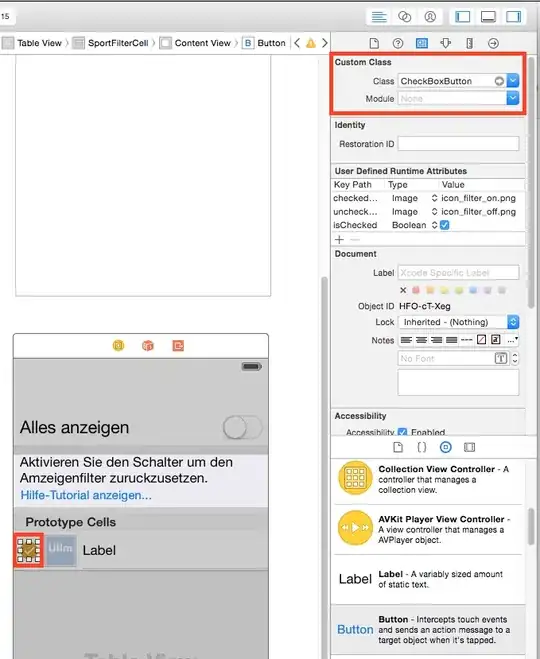
Desired layout

What I currently have:

Wrong layout

A simple example of code to reproduce it:

.grid {
  display: grid;
  background-color: #eee;
  grid-gap: 5px 5px;
  grid-template-columns: repeat(2, 1fr);
  grid-auto-flow: dense;
}

.box {
  background-color: #444;
  color: #fff;
  border-radius: 5px;
  padding: 60px;
  font-size: 150%;
}

.grid__1 {
  background-color: #ccc;
  grid-column: 1 / 2;
  padding: 5px;
  font-size: 1rem;
}

.grid__item {
  grid-column: span 1;
  grid-row: span 2;
}
<div class="grid">
  <div class="box grid__1">head</div>
  <div class="box grid__item">1</div>
  <div class="box grid__item">2</div>
  <div class="box grid__item">3</div>
  <div class="box grid__item">4</div>
  <div class="box grid__item">5</div>
  <div class="box grid__item">6</div>
</div>

I made a live example here : https://jsfiddle.net/rLpqt75d/3/

Michael Benjamin
  • 346,931
  • 104
  • 581
  • 701
Calan
  • 43
  • 5

4 Answers4

1

define a pair of rows for the property grid-auto-rows, this will set the correct size :

.grid {
  display: grid;
  background-color: #eee;
  grid-gap: 5px 5px;
  grid-template-columns: repeat(2, 1fr);
  grid-auto-flow: dense;
  
  grid-auto-rows: 40px 200px; /* added */
}
.box {
  background-color: #444;
  color: #fff;
  border-radius: 5px;
  padding: 60px;
  font-size: 150%;
}
.grid__1 {
  background-color: #ccc;
  grid-column: 1 / 2;
  padding: 5px;
  font-size: 1rem;
}

.grid__item {
  grid-column: span 1;
  grid-row: span 2;
}
<div class="grid">
  <div class="box grid__1">head</div>
  <div class="box grid__item">1</div>
  <div class="box grid__item">2</div>
  <div class="box grid__item">3</div>
  <div class="box grid__item">4</div>
  <div class="box grid__item">5</div>
  <div class="box grid__item">6</div>
</div>
vals
  • 61,425
  • 11
  • 89
  • 138
  • Indeed, it works, but I would like not to fix the size of the rows, let them adapt to the real content – Calan Jul 14 '21 at 12:42
1

/* height is your var */
.grid {
  display: grid;
  background-color: #eee;
  grid-gap: 5px 5px;
  grid-template-columns: repeat(2, 1fr);
  grid-auto-rows: 40px 1fr;
  height: 100vh;
}
.box {
  background-color: #444;
  color: #fff;
  border-radius: 5px;
  padding: 60px;
  font-size: 150%;
}
.grid__head {
  background-color: #ccc;
  grid-column: 1 / 2;
  padding: 15px;
  font-size: 1rem;
 
}

.grid__item {
  grid-column: span 1;
  grid-row: span 2;
}
<div class="grid">
  <div class="box grid__head">head</div>
  <div class="box grid__item">1</div>
  <div class="box grid__item">2</div>
  <div class="box grid__item">3</div>
  <div class="box grid__item">4</div>
  <div class="box grid__item">5</div>
  <div class="box grid__item">6</div>
</div>

enter link description here

amirrr1987
  • 59
  • 6
  • And how can I do if I don't know the size of the odd line ? For example, if I don't know the "40px" in `grid-auto-rows: 40px 1fr` ? – Calan Jul 14 '21 at 12:57
1

Switch from grid-row: span 2 to span 3 (or 4) on .grid__item.

.grid {
  display: grid;
  background-color: #eee;
  grid-gap: 5px 5px;
  grid-template-columns: repeat(2, 1fr);
  grid-auto-flow: dense;
}

.box {
  background-color: #444;
  color: #fff;
  border-radius: 5px;
  padding: 60px;
  font-size: 150%;
}

.grid__1 {
  background-color: #ccc;
  grid-column: 1 / 2;
  padding: 5px;
  font-size: 1rem;
}

.grid__item {
  grid-column: span 1;
  grid-row: span 3;  /* ADJUSTMENT */
}
<div class="grid">
  <div class="box grid__1">head</div>
  <div class="box grid__item">1</div>
  <div class="box grid__item">2</div>
  <div class="box grid__item">3</div>
  <div class="box grid__item">4</div>
  <div class="box grid__item">5</div>
  <div class="box grid__item">6</div>
</div>

The problem is that the first card on the left (number 2) grows to compensate for the offset, but all cards must have the same size.

If you switch from having the items span two rows (grid-row: span 2) to instead span three (grid-row: span 3), or four, the items can better absorb the offset height.

2 rows (original layout) — notice how the rows are laid out

enter image description here

3 rows (revised layout)

enter image description here

This may also be an alternative: CSS-only masonry layout

Michael Benjamin
  • 346,931
  • 104
  • 581
  • 701
  • Thanks. It only works if the offset is a disvision by 3 of the height of the cards. What if I don't know the height of the offset? – Calan Jul 14 '21 at 13:02
  • I think you'll have to experiment with different offset sizes to see which span value is most appropriate for the rows. You don't want any defined sizes, so it makes this layout tricky. Perhaps grid isn't your best solution here. Consider CSS columns and flexbox, in addition to grid. – Michael Benjamin Jul 14 '21 at 14:01
1

I did some research and it looks like you are trying to replicate a mansonry-layout. If you don't know what it is, it is the layout used by pintarest.
After a while googleing I found a great article you could look into:
https://kulturbanause.de/blog/responsive-masonry-layout-mit-css/

I'll try to summarize: In the future we will get a css property: grid-template-rows: masonry;

But until then we will have to stick to flex-box.

I copied the example of the blog post to a fiddle and modified it a little for a better overview:
https://jsfiddle.net/8k1nyg39/41/

Hope I could help someone (:

EDIT: So I experimented a bit with it and it seems like you need a predetermined height for your container...

If you need your container to change height dynamically the only remaining workaround I know of would be a js library like Magic Grid ...