2

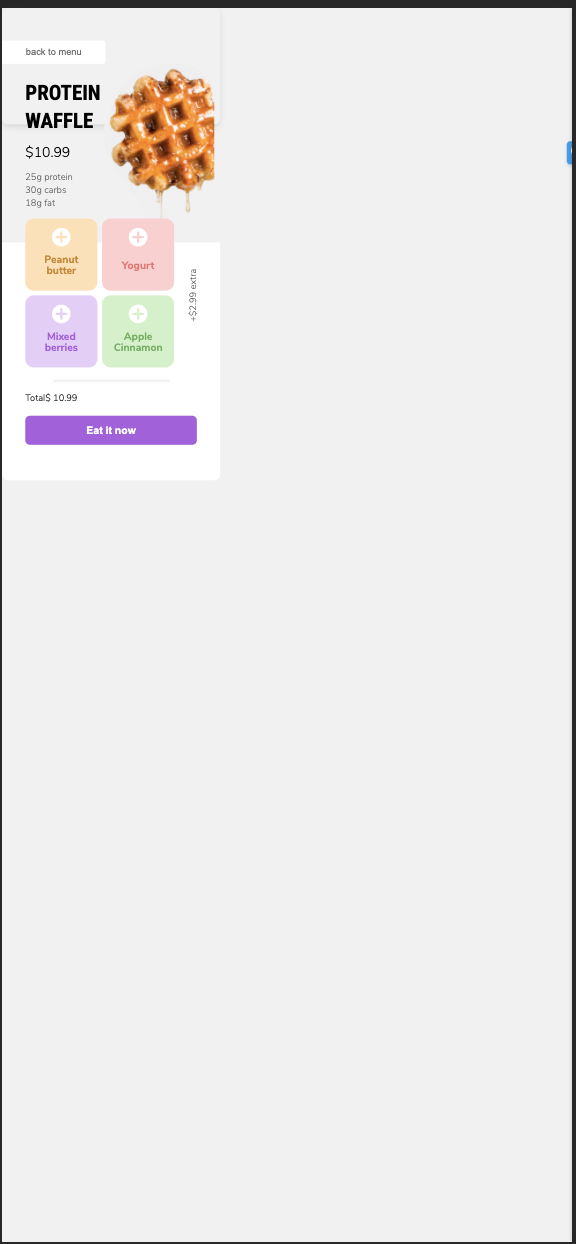
Currently, I have a project I am building for mobile. Ideally, I would like for the bit in the div to take up the entire screen on say an iPhone. However, the issue is as it is resized the contents of the div become smaller and the body appears below.

I want the contents of the div to continue to expand with the height becoming greater instead of becoming smaller. Here is a link to what it looks like currently

I would like for that bit with the content to take up the entire page.

Here are my body styles:

  font-family: Nunito Sans;
  background-color: #F1F1F1;
  border-radius: 10px;
  box-shadow: 0px 4px 10px rgba(0, 0, 0, 0.1);
  width:375px;
  height: 200px;
  overflow-x: hidden;
  margin: 0;
  padding: 0;
  position: absolute;
}

Those are the only global styles and there is no styling in the div yet.

Ben Smith
  • 43
  • 1
  • 5

3 Answers3

2

Add this line to your HTML header: <meta name="viewport" content="width=device-width, initial-scale=1.0">

And set the width and height to 100%, or you can set width to 100vw and height to 100vh.

ابن آدم
  • 336
  • 3
  • 14
1

Try this below code

1> Add viewport in the head tag

<meta name="viewport" content="width=device-width, initial-scale=1">

2> add width and height 100% also min-width and min-height to 100%

font-family: Nunito Sans;
  background-color: #F1F1F1;
  border-radius: 10px;
  box-shadow: 0px 4px 10px rgba(0, 0, 0, 0.1);
  width: 100%;
  height: 100%;
  min-width:100%;
  min-height: 100%;
  overflow-x: hidden;
  margin: 0;
  padding: 0;
  position: absolute;
}
Vishal
  • 235
  • 1
  • 15
  • you need to give height as 100vh to the parent element then only height 100% works in your case, because by default the height of parent element is auto – Shivam Jul 21 '21 at 05:27
0

use vw (total width screen available) and vh (total height screen avaiable) and use it as width and height in body.

body {
  margin:0px;
  width:100vw;
  height:100vh;
  overflow:auto;
}

Then add viewport meta in your <head> to scale the screen pixel correctly

<meta name="viewport" content="width=device-width, initial-scale=1">
shunz19
  • 495
  • 4
  • 13