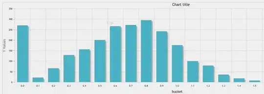
I am trying to plot yearly count of values in plotly, however I am getting unnecessary xticks. My plotly plot looks like:

However, I want something like this:

That extra, xticks is something I don't want.
My plotly code looks like:
fig = go.Figure()
fig.add_trace(go.Bar(x = data.year.value_counts().index.tolist(),
                     y = data.year.value_counts().values.tolist(),

    marker_color='#330C73',
    opacity=0.75))
fig.update_xaxes(tickmode = 'array')
fig.update_layout(bargap=0.2, # gap between bars of adjacent location coordinates
    #bargroupgap=0.1, # gap between bars of the same location coordinates,
      title={
        'text': "Yearly Enrolment",
        'y':0.95,
        'x':0.5,
        'xanchor': 'center',
        'yanchor': 'top'},
      xaxis_title="Year",
      yaxis_title="Count",
      font=dict(
          family="Arial",
          size=10
      ),margin=go.layout.Margin(
        l=0, #left margin
        r=0, #right margin
        b=0, #bottom margin
        t=20.5  #top margin
    ),
      width=500,
      height=350,
      legend=dict(orientation="h", font=dict(size=8)),
      paper_bgcolor='rgba(255, 255, 255, 0)',
      plot_bgcolor='rgba(255, 255, 255, 0)')
fig.show()
