0

I did a value count with a groupby, here is the code. All_data4 is a dataframe.

typecount = all_data4.groupby("Index_Date")['UPLOAD_TYPE'].value_counts()

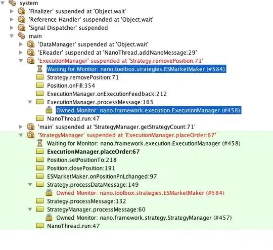
Typecount looks like the following. How can I plot with X axis being the date, and plot two bar charts grouped by the UPLOAD_TYPE for each date?

screenshot

Yevhen Kuzmovych
  • 10,940
  • 7
  • 28
  • 48
Janet
  • 1
  • 1
  • What have you tried so far? – Yevhen Kuzmovych Jul 27 '21 at 13:33
  • Hi, welcome to SO! Please post your data as *code* that we can copy-paste instead of screenshots. See [here](https://stackoverflow.com/questions/20109391/how-to-make-good-reproducible-pandas-examples) for how to ask. – not_speshal Jul 27 '21 at 13:34

1 Answers1

0

Starting from you point... First, you could reset your index:

typecount.reset_index(inplace=True)

Then, split new index column into 2 columns:

new_df =pd.DataFrame(typecount["index"].to_list(), columns=['Index_Date', 'UPLOAD_TYPE'])

Then you can plot your data in stacked mode:

  # importing package
    import matplotlib.pyplot as plt
      
    # plot bars in stack manner
    plt.bar(new_df['Index_Date'], new_df[new_df['UPLOAD_TYPE']=='Actual'], color='r')
    plt.bar(new_df['Index_Date'] , new_df[new_df['UPLOAD_TYPE']=='Pro'] , color='b')
    plt.show()