1

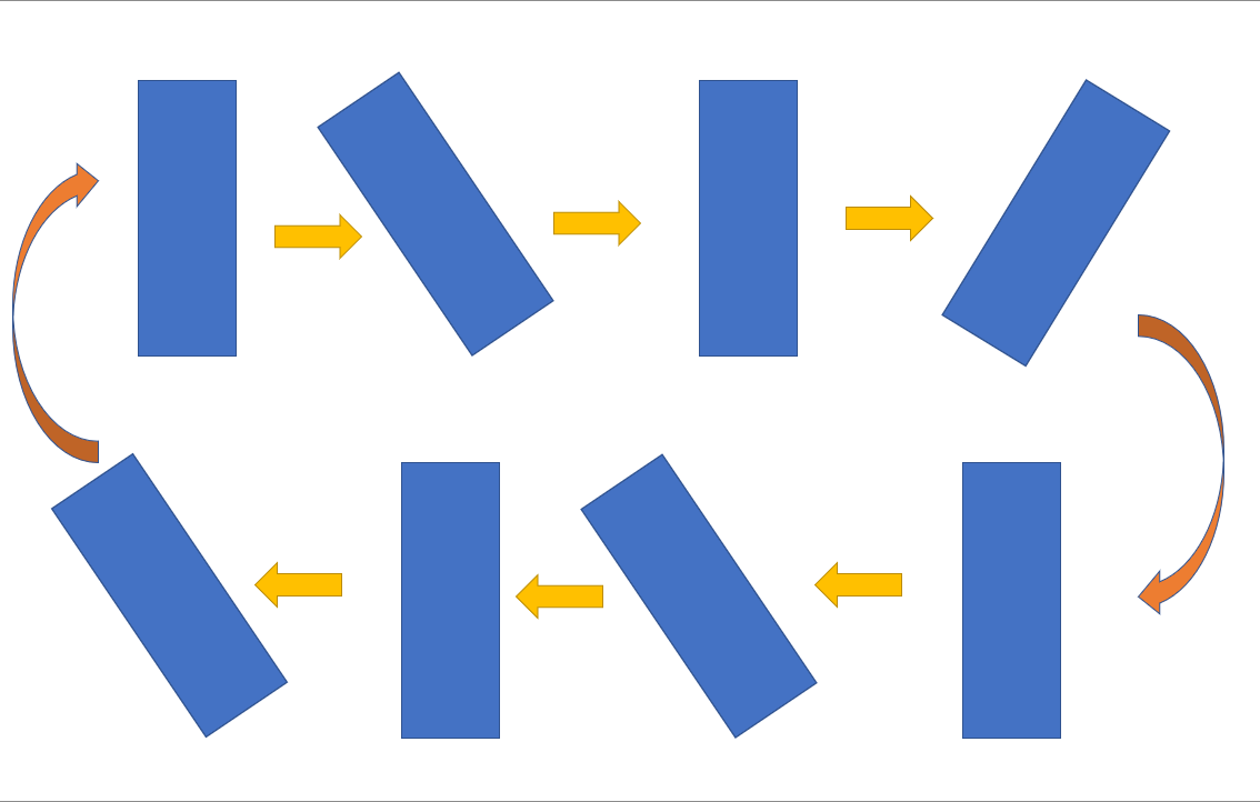
I am trying to make an Oscillatory animation using css as shown below:

enter image description here

Here's how I have created my animation:

@keyframes rotateFeather {
    0% {
        transform: rotate(0deg);
    }
    25% {
        transform: rotate(-180deg);
    }
    50% {
        transform: rotate(-90deg);
    }
    75% {
        transform: rotate(90deg);
    }
    100% {
        transform: rotate(180deg);
    }
}

Here is my class: (Using sccs)

.logo {
    height: 5rem;
    transition: all 0.3s ease;

    &box {
        position: absolute;
        top: 4rem;
        left: 4rem;
    }

    &:hover {
        animation-name: rotateFeather;
        animation-duration: 1s;
        animation-iteration-count: infinite;
        animation-timing-function: linear;
    }
}

Here I am facing this problem: When it reaches 180deg at 100% it abruptly resets to 0 which I want to make smooth.

How is it possible to do the same?

Shivam Sahil
  • 4,055
  • 3
  • 31
  • 62

2 Answers2

2

To ensure smooth transition, We need to make sure that transformation at 0 and 100% must match with the original state:

@keyframes rotateFeather {
    0% {
        transform: rotate(0deg); //-30
        transform-origin: bottom;
    }
    20% {
        transform: rotate(-30deg); //-60
        transform-origin: bottom;
    }
    40% {
        transform: rotate(0deg); //-30
        transform-origin: bottom;
    }
    60% {
        transform: rotate(30deg); // 0
        transform-origin: bottom;
    }
    80% {
        transform: rotate(60deg); //30
        transform-origin: bottom;
    }
    100% {
        transform: rotate(0deg); //30
        transform-origin: bottom;
    }
}

This helped me to solve my issue. I am not sure, if I need to add transform-origin in every stage, if someone can elaborate better on that, that would be helpful.

Shivam Sahil
  • 4,055
  • 3
  • 31
  • 62
2

Here's a simplified version of your latest animation code (with a Codepen to see it in action):

@keyframes rotateFeather {
    0% {
        transform: rotate(0deg);
    }
    20% {
        transform: rotate(-30deg);
    }
    80% {
        transform: rotate(60deg);
    }
    100% {
        transform: rotate(0deg);
    }
}

.logo {
    transform-origin: bottom;

    &:hover {
        animation: rotateFeather 1s linear infinite;
    }
}

Some points about the above tweaks:

  1. You don't need transform-origin at every keyframe. You can set it globally.
  2. You can roll all of your animation properties into a single shorthand rule.
  3. You can skip keyframes that are mathematically interpolating where the animation would be going anyway (notice I omitted 40% and 60% above and it looks the same).
  4. You don't need any transition rules on elements that you are animating with keyframes. Unless you're using it for something else, but you want to be careful to avoid attempting to animate the same property on the same element with both animation and transition simultaneously, as it will break the animation in question.
Aaron Sarnat
  • 1,207
  • 8
  • 16