1

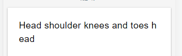
I have a code below that does word wrap, but the problem is, it cuts off the word just like an example output. Expected output, the second "head" should be in the next line and not cut.

enter image description here

Here is the code.

<div className="relative mt-px-14 mx-px-8 p-px-25">
  <div className="relative">
        <div className="absolute w-full text-20 whitespace-pre-line break-words">
          Head shoulder knees and toes head
        </div>
        .... more codes here
  </div>
</div>

Tailwind css documentation

> break-all ==> word-break: break-all;
> whitespace-pre-line   ===>  white-space: pre-line;
Sarthak Raval
  • 1,001
  • 1
  • 10
  • 23

4 Answers4

1

Actually the styles are working fine.

I found out that my custom keyboard does not returning " " space if I tap spacebar. It instead return &nbsp; which causes the problem.

What I did is I replace &nbsp; to space(" "), and it solves the problem. Replacing &nbsp; from javascript dom text node

0

As you can see in the snippet below, the value for word-break you were looking for is break-word, not break-all.

As per the link,

break-all   To prevent overflow, word may be broken at any character
break-word  To prevent overflow, word may be broken at arbitrary points

.one {
  word-break: break-all;
  white-space: pre-line;
}

.two {
  margin-top: 20px;
  white-space: pre-line;
  word-break: break-word;
}
<div class="one">
  Lorem, ipsum dolor sit amet consectetur adipisicing elit. Accusamus deserunt consectetur iste obcaecati nam placeat adipisci beatae explicabo dolorem cum magnam a officiis nihil repudiandae eligendi, tempore ducimus maxime veniam.
</div>

<div class='two'>
  Lorem, ipsum dolor sit amet consectetur adipisicing elit. Accusamus deserunt consectetur iste obcaecati nam placeat adipisci beatae explicabo dolorem cum magnam a officiis nihil repudiandae eligendi, tempore ducimus maxime veniam.
</div>
Abin Thaha
  • 4,493
  • 3
  • 13
  • 41
0

Also You can use CSS hyphens property.

This is a quick demo:

article {
  max-width: 500px;
  margin: 0 auto;
  width: 100%;
  text-align: justify;
}

article p {
  -webkit-hyphens: auto;
  -moz-hyphens: auto;
  -ms-hyphens: auto;
  hyphens: auto;
}
<article lang="en">
  <p>As designers attempting to creating functional work, oftentimes we are required to make our designs look as finished as possible.</p>
  <p>For example, if you are designing a brand new website for someone, most times you will have to make sure the prototype looks finished by inserting text or photos or what have you. The purpose of this is so the person viewing the prototype has a chance to actually feel and understand the idea behind what you have created.</p>
</article>
user3733831
  • 2,886
  • 9
  • 36
  • 68
0

Please use overflow-wrap: break-word; for

.

article {
  max-width: 500px;
  margin: 0 auto;
  width: 100%;
  text-align: justify;
}

article p {
  overflow-wrap: break-word;
}
<article lang="en">
  <p>As designers attempting to creating functional work, oftentimes we are required to make our designs look as finished as possible.</p>
  <p>For example, if you are designing a brand new website for someone, most times you will have to make sure the prototype looks finished by inserting text or photos or what have you. The purpose of this is so the person viewing the prototype has a chance to actually feel and understand the idea behind what you have created.</p>
</article>
Tony Tin Nguyen
  • 170
  • 1
  • 7