3

I have a problem with errorbars in bar chart in ggplot. I have an interaction between categorical (condition) and continuous (moderator) variable. I want to show error bars, but they are the same color as bars, which makes them impossible to interpret. I tried adding color = "black" etc. for error bars, but it won't change anything. Here is a code:


moderator = runif(n = 100, min = 1, max = 7)
condition <- rep(letters[1:2], length.out = 100)
y = runif(n = 100, min = 1, max = 100)

df <- data.frame(moderator, condition, y)


lm21 <- lm(y~ condition* moderator, data = df)
summary(lm21) 

library(ggeffects)
library(ggplot2)
library(magrittr)


    pd <- position_dodge() 
ggeffect(lm21, terms = c("condition", "moderator")) %>%  
  plot(show.title = FALSE) +
  stat_summary(fun.y = mean, geom = "bar", position = pd, width = 0.25) +
  stat_summary(fun.data = mean_cl_boot, geom = "errorbar",
               position = pd, size = 8.5, alpha=13.2) +
  scale_y_continuous("Voting", limits = c(0, 100)) + 
  scale_color_discrete(name = "Control", labels = c("Low", "Medium", "High")) +
  scale_x_continuous(name = "Condition",
                     breaks = 0:1,
                     labels = c("Low","High")) 

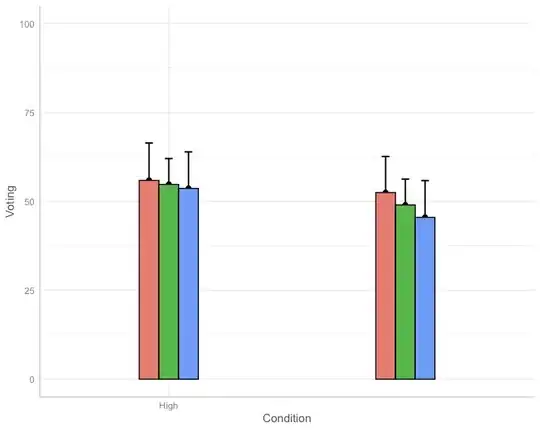
The graph looks like this:

enter image description here

How can I change the color of error bars so that they are fully visible?

Thank you in advance!
3 Answers3

3

I tried to convert the ggeffect value to a data.frame and ended like this, hope it's what you wanted. The width control is made by hand sorry, I played with it to put it in the middle. Maybe someone better than me knows how to do it.

  ggplot(as.data.frame(ggeffect(lm21, terms = c("condition", "moderator"))), aes(x = factor(x))) +
    geom_col(aes(y = predicted, fill = factor(group)), position = position_dodge2(width = .5, preserve = "single", padding = 0)) +
    geom_errorbar(aes(ymin = conf.low, ymax = conf.high, group = factor(group)), position = position_dodge(width = .9), width = .15) +
    geom_point(aes(y = predicted, group = factor(group)), position = position_dodge2(width = .9)) +
    scale_fill_discrete(name = "Control", labels = c("Low", "Medium", "High")) +
    scale_y_continuous("Voting", limits = c(0, 100)) +
    scale_x_discrete(name = "Condition", labels = c("Low","High")) +
    theme_light()

enter image description here

2

Ok it's not the easiest way but that's what I'd done:

p = ggeffect(lm21, terms = c("condition", "moderator")) %>%  
  plot(show.title = FALSE) +
  stat_summary(fun.y = mean, geom = "bar", position = pd, width = 0.25) +
  stat_summary(fun.data = mean_cl_boot, geom = "errorbar",
               position = pd, size = 8.5, alpha=13.2) +
  scale_y_continuous("Voting", limits = c(0, 100)) + 
  scale_color_discrete(name = "Control", labels = c("Low", "Medium", "High")) +
  scale_x_continuous(name = "Condition",
                     breaks = 0:1,
                     labels = c("Low","High"))+
  scale_colour_manual(values = rep('black',3))+
  theme(legend.position = 'none') 

The output is:

enter image description here

The only thing is that the legend is missing because scale_colour_manual changes it. But you can use this post to extract the legend How to plot just the legends in ggplot2? and the combine it to your plot.

I hope this is what you wanted

elielink
  • 1,174
  • 1
  • 10
  • 22
  • Thank you for your answer, I will definitely try this out. However, isn't it possible to add also a lower part of the error bar, like e.g. here? https://pythonforundergradengineers.com/images/bar_plot_with_error_bars.png – Anna Potoczek Aug 13 '21 at 10:44
1

Here is another solution based on grobs manipulation.

p <- ggeffect(lm21, terms = c("condition", "moderator")) %>%  
  plot(show.title = FALSE) +
  stat_summary(fun.y = mean, geom = "bar", position = pd, width = 0.25) +
  stat_summary(fun.data = mean_cl_boot, geom = "errorbar",
               position = pd, size = 8.5, alpha=13.2) +
  scale_y_continuous("Voting", limits = c(0, 100)) + 
  scale_color_discrete(name = "Control", labels = c("Low", "Medium", "High")) +
  scale_x_continuous(name = "Condition",
                     breaks = 0:1,
                     labels = c("Low","High")) 

# Change the order of ggplot layers (error bars are printed after mean bars)
p$layers <- p$layers[c(3,1,2,4)]

# Set colors of polyline grob (error bars)
q <- ggplotGrob(p)
q$grobs[[6]]$children[[5]]$gp$col <- rep("black",6)
grid::grid.draw(q)

enter image description here

Marco Sandri
  • 23,289
  • 7
  • 54
  • 58