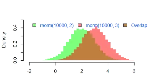
I am visualizing the results of a survey. The answers are long and I would like to fit them entirely into the graph. Therefore, I would be very grateful if you could point me to a way to have multi-line xticklabels, or include the xticklabels in a legend on the side as seen in this example:
Because otherwise I would have to make the graph very wide to fit the entire answer. My current code and the resulting plot look as follows:
import seaborn as sns
from textwrap import wrap

sns.set(style="dark")
catp = (sns.catplot(data=results, x='1',
                    kind='count',
                    hue_order=results.sort_values('1')['1'],
                    palette='crest',
                    height=3.3,
                    aspect=17.4/7)
        .set(xlabel=None,
             ylabel='Number of Participants',
             title="\n".join(wrap("Question 1: Out of the three options, please choose the one you would prefer your fully autonomous car to choose, if you sat in it.", 90)))
)
plt.tight_layout()
catp.ax.set_yticks((0,10,20,30,40))
for p in catp.ax.patches:
    percentage = '{:.1f}%'.format(100 * p.get_height()/92)
    x = p.get_x() + p.get_width() / 2 - 0.05
    y = p.get_y() + p.get_height() + 0.3
    catp.ax.annotate(percentage, (x, y), size = 12)
plt.show()
Best regards!
Edit: You can create a sample dataframe with this code:
import pandas as pd
import numpy as np
from itertools import chain

x = (np.repeat('Brake and crash into the bus', 37),
np.repeat('Steer into the passing car on the left', 22),
np.repeat('Steer into the right hand sidewall', 39))

results = pd.DataFrame({'1': list(chain(*x))})


