I'm looking for help navigating and visualizing a HUGE field study dataset in R. I would like to automate visualizing subsets of the data. My field study involves various samples (numeric) taken from different ponds (factor) in multi-pond systems (factor) across seasons (factor). I want to graph how various numeric measurements (x) vary with depth (y) for each pond system with point shape according to pond (within the system being considered) and color by season.
To do this, I think I need to compress the data for each pond system using "nest:"
comp_nested <- comp %>% group_by(System) %>% nest()
This is what the nested dataframe looks like
Where I'm getting stuck is at accessing each system's nested data to graph parameters of interest in a for loop:
for (i in comp_nested$System) {

unnested <- unnest(comp_nested[2], as_df)
str(unnested)

scatter_fun = function(x, y) {
     ggplot(unnested, aes(x = .data[[x]], y = .data[[y]], color=Season, shape=Pond, size=0.5) ) +
    scale_y_reverse()+
          geom_point() +
  theme(axis.text = element_text(size = 10), panel.background=element_rect(fill="white", color="black"))+
  theme(legend.key=element_rect(fill="white"), legend.title= element_text(size=10), legend.text=element_text(size=10))+
  guides(size=FALSE)+
  guides(color = guide_legend(override.aes = list(size = 2)), shape=guide_legend(override.aes = list(size = 2)))
}

scatter_fun(x="Ammonia_N", y="Depth_in")
}
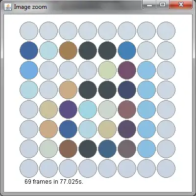
I can get the code to work for ALL the systems, but I can't create a separate graph for each system: This graph shows how ammonia varies with depth for all ponds in all systems across seasons.
Thanks in advance for any help you can provide!