Now im having an input text element which be warpped by a div container (form-group)
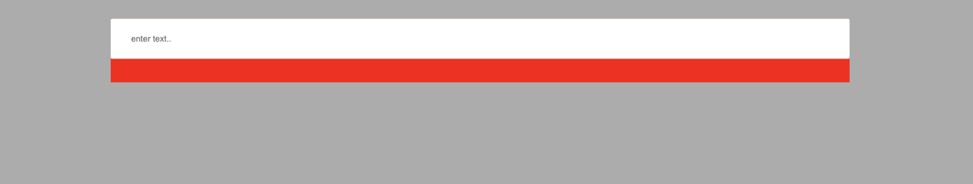
And i set the width to the input text element become 100% (width: 100%). And i expect that the input text it will cover the entire width of the form-group div element. And the result is kinda weird to me. The input text, it likes it flow out of the form-group element, like the this picture here:
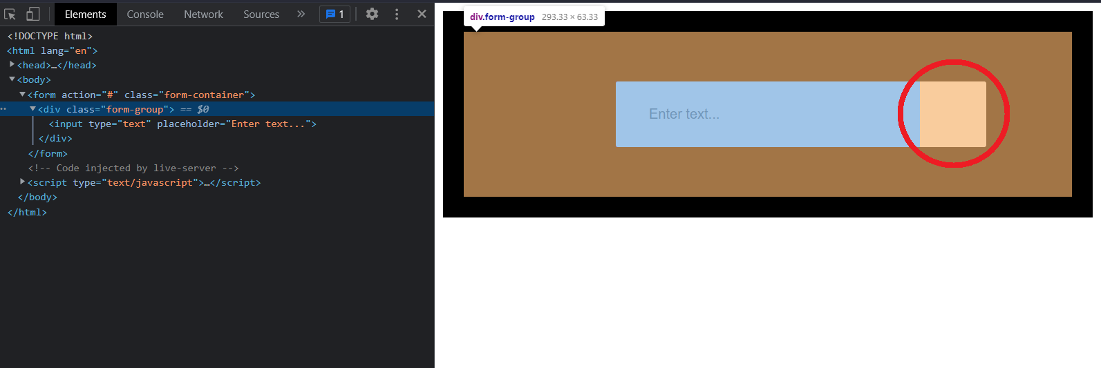
In this picture, im currently hover the form-group element, and you can see the orange part, is the margin of the it, but you can see, the input text element, the part i highlighed is like overlaying the margin of the form-group element, which proved that the input text element is flow out of the container element of it, which is the form-group element. And that's weird, at least to me, because I set the width to 100%, and so i think it should be cover the container element of it. Please help me to understand this.
I know i can use the overflow property to fix but, i want to know why this is happening, so hopefully, someone can help me with this, thank you so much.
.form-container {
background-color: black;
padding: 20px;
}
.form-group {
width: 50%;
font-size: 1.5rem;
background-color: red;
margin: 3rem auto;
display: block;
}
input {
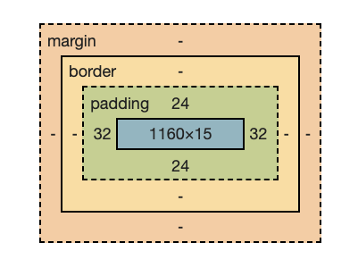
padding: 1.5rem 2rem;
border-radius: 2px;
border: none;
outline: none;
width: 100%;
color: var(--primary-color);
}<form action="#" class="form-container">
<div class="form-group">
<input type="text" placeholder="Enter text...">
</div>
</form>