4

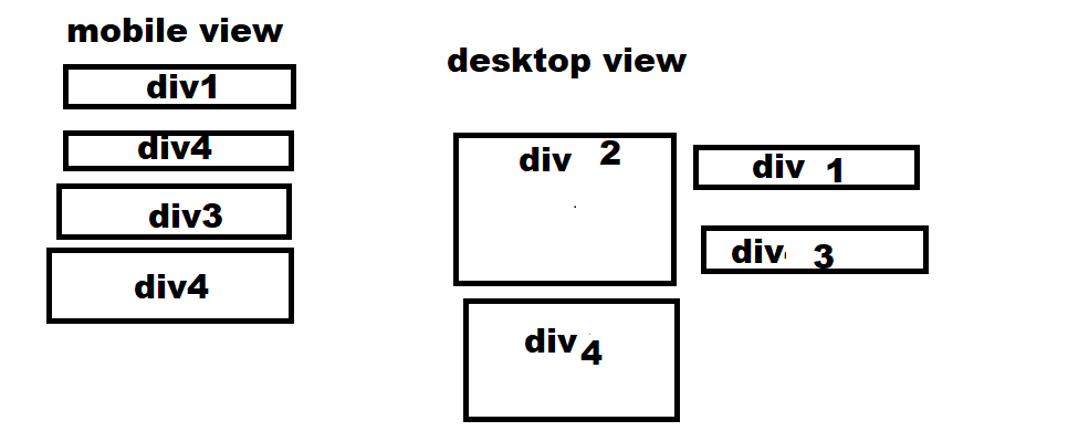
I have two images and two paragraphs next to each other, I have used the approach as shown in the code and it worked fine. The problem occurs when I set both images' height to 400px so that if the paragraph is taking more space than 400px, it should take the space around the images. It works fine in mobile view but not in desktop view. In the image below please consider div 2 and 4 as paragraph and div 1 and 3 as images.

enter image description here

I want it to look like this:

enter image description here

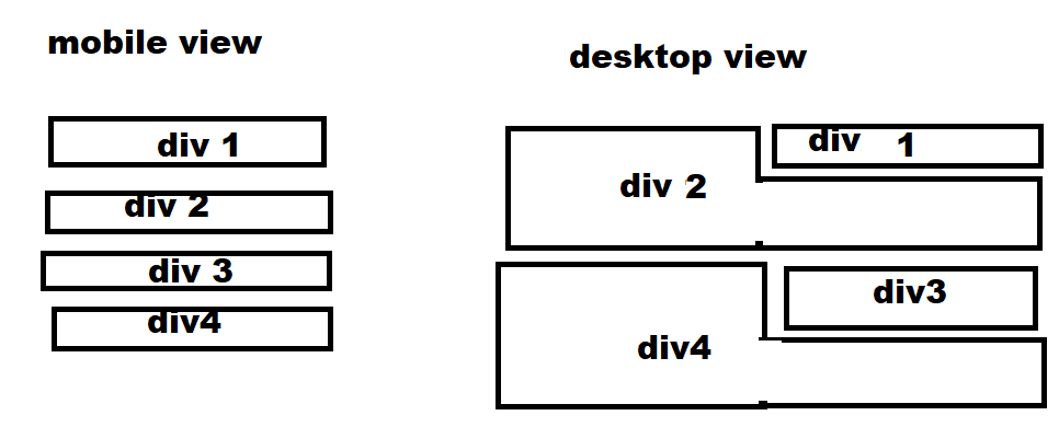
I want the paragraph to take 100% space if it is long and then the same with div 3 and 4. Here is my code:

<div class="col-11">
    <div style="margin-left:10px;margin-right:10px;">
  {% for news in news %}
  <h1 class="text-center" style="color: black; margin-top:20px; font-size:50px;">{{news.title}}</h1>
  <div class="row g-2">
  <div class="col-12 col-md-6 order-2 order-md-1" style="color: #025; margin-top:20px; font-size:20px;">
    {% if news.para_one %}
    <p>{{news.para_one|safe}}</p>
    {% endif %}
  </div>
  <div class="col-12 col-md-6 order-1 order-md-2">
      {% if news.image %}
    <img src="{{news.image.url}}" alt="" class="img" style="height: 400px; width:650px;">
    {% endif %}
  </div>
  </div>
  <div class="detail" style="color: #025; margin-top:20px; font-size:20px;">
    {% if news.para_two %}
    <p >{{news.para_two|safe}}</p>
    {% endif %}
  </div>
  <div class="col-12">
    {% if news.disclaimer %}
    <p style="border:1px solid #025; border-top: 5px solid #025; font-size:20px; font-weight:700">Disclaimer :<span style="font-weight: 500;">{{news.disclaimer}}</span></p>
    {% endif %}
  </div>
  <div style="margin-bottom: 20px;">
    <p style="margin-left:10px; font-size :25px; font-weight:700;">Written By : <span style="color: #025;">{{news.written_by}}</span> </p>
    <p style="margin-left:10px; font-size :25px; font-weight:700;">Date & Time: <span style="color: #025;">{{news.joined_date}}</span> </p>
  </div>
  {% endfor %}

CSS:

.col-11{
  margin-left: auto;
  margin-right: auto;
  height: 100%;
  background-color: #fff;
}
.row > .col-md-6:last-child:nth-child(odd) {
  width: 100%;
}
@media screen and (max-width: 600px) {
  .img{
    height: 200px !important;
    width: 100% !important;
  }
}

I have tried this solution https://stackoverflow.com/a/68943035/14777930 but maybe it is not what I am looking for. Please do not mind these tags all the data is fetched from the database. Any help would be appreciated.

Rafia Zafar
  • 363
  • 1
  • 13
Shreyash mishra
  • 738
  • 1
  • 7
  • 30
  • 1
    As a side note, use you can move all of the margin styles into bootstrap classes with the [spacing utilities](https://getbootstrap.com/docs/5.1/utilities/spacing/). – tdy Sep 12 '21 at 16:10

3 Answers3

5

Like the other said you can use the float property on your image. But please don't write custom css for that, just use the bootstrap's float utils class instead. In your case, you should add the class float-lg-end to your image to make it float: right on large screens:

<link href="https://cdn.jsdelivr.net/npm/bootstrap@5.0.2/dist/css/bootstrap.min.css" rel="stylesheet" integrity="sha384-EVSTQN3/azprG1Anm3QDgpJLIm9Nao0Yz1ztcQTwFspd3yD65VohhpuuCOmLASjC" crossorigin="anonymous">

<div class="col-11">
  <div style="margin-left:10px;margin-right:10px;">
    <img src="https://www.google.com/images/branding/googlelogo/2x/googlelogo_color_272x92dp.png" class="float-lg-end" style="width: 200px;" />
    <p>Lorem ipsum dolor sit amet, consetetur sa dipscing elitr, sed diam nonumy eirmod tempor invidunt ut labore et dolore magna aliquyam erat, sed diam voluptua. At vero eos et accusam et justo duo dolores et ea rebum. Stet clita kasd gubergren, no sea
      takimata sanctus est Lorem ipsum dolor sit amet. Lorem ipsum dolor sit amet, consetetur sadipscing elitr, sed diam nonumy eirmod tempor invidunt ut labore et dolore magna aliquyam erat, sed diam voluptua. At vero eos et accusam et justo duo dolores
      et ea rebum. Stet clita kasd gubergren, no sea takimata sanctus est Lorem ipsum dolor sit amet.</p>
  </div>
</div>

Open the snippet in full page page and resize your browser to see the behaviour.

Micah
  • 479
  • 1
  • 7
  • 17
johannchopin
  • 13,720
  • 10
  • 55
  • 101
  • When stacking these divs, it overlaps, so where do you define the end limits, to ensure it isn't digging too far into the larger div? – Micah Sep 16 '21 at 12:57
  • 1
    It's coming from the size `lg` in `float-lg-end`. There is also `sm`, `md`, `lg`, `xl` and `xxl`. – johannchopin Sep 16 '21 at 13:13
  • That effects the height of the div? Doesn't that relate to the screen size? – Micah Sep 16 '21 at 13:21
1

You can try solving your problem by using the float property in the image tag and wrap it in a paragraph tag. This will wrap your text around the image in desktop view and it also works as you want in the mobile view, without using media queries.

here is a link to my code: https: Codepen link

<div class='divsize'>
    <p><img class='imageright' src="https://images.unsplash.com/photo-1453728013993-6d66e9c9123a?ixid=MnwxMjA3fDB8MHxzZWFyY2h8Mnx8dmlld3xlbnwwfHwwfHw%3D&ixlib=rb-1.2.1&w=1000&q=80"  />
  Lorem ipsum dolor sit amet, consectetur adipiscing elit. Maecenas viverra pharetra purus nec aliquet. Quisque et felis sed augue iaculis imperdiet et sit amet odio. Quisque molestie erat et tortor accumsan, nec bibendum tellus interdum. Aliquam tempus nisl quis eros aliquam, eget pretium leo placerat. Duis vel efficitur sem. Aliquam erat volutpat. Fusce ut justo eu ante ultrices consequat. Suspendisse tempus lacus eget efficitur rutrum. Fusce vel tellus tempus, accumsan nisl ut, varius ipsum. Vivamus dui sapien, ultricies dapibus tortor eget, placerat ultrices erat. Praesent massa massa, aliquet non dolor in, rutrum ultricies massa.
.</p>

  </div>

CSS


 .imageright{
   width: 400px ;
   height: 400px ;
   margin: 10px ;
   float: right ;
 }

.divsize{
 min-height:410px
}

  • That's true but doesn't use bootstrap's float utils class. Check them out https://getbootstrap.com/docs/5.0/utilities/float/ so you won't write `float: right` anymore ;) – johannchopin Sep 11 '21 at 12:56
1

A mobile-first approach

I see you are using custom media breakpoint (600px) to switch from mobile to desktop layout, so using class="float-lg-end" as suggested in a previous answer would only trigger the float property above 992px viewport width.

So we would ...

  1. Set the float: right; and change the width properties on the img at the 600px breakpoint.
  2. Then we add the .clearfix to the parent container to clear the floated content.

See the example below using a mobile-first approach...

img {
  width: 100%;
  height: 200px;
  object-fit: cover;
  margin: 10px;
}

@media only screen and (min-width: 600px) {
  img {
    width: 400px;
    float: right;
  }
}
<link href="https://cdn.jsdelivr.net/npm/bootstrap@5.0.2/dist/css/bootstrap.min.css" rel="stylesheet" integrity="sha384-EVSTQN3/azprG1Anm3QDgpJLIm9Nao0Yz1ztcQTwFspd3yD65VohhpuuCOmLASjC" crossorigin="anonymous">

<div class="col-11">
  
  <div class="m-3 clearfix">
    <img src="https://picsum.photos/400" />
    <p class="px-2">Lorem ipsum dolor sit amet, consetetur sa dipscing elitr, sed diam nonumy eirmod tempor invidunt ut labore et dolore magna aliquyam erat, sed diam voluptua. At vero eos et accusam et justo duo dolores et ea rebum. Stet clita kasd gubergren, no sea
      takimata sanctus est Lorem ipsum dolor sit amet.At vero eos et accusam et justo duo dolores
      et ea rebum. Stet clita kasd gubergren, no sea takimata sanctus est Lorem ipsum dolor sit amet. Lorem ipsum dolor sit amet, consetetur sadipscing elitr, sed diam nonumy eirmod tempor invidunt ut labore et dolore magna aliquyam erat, sed diam voluptua. At vero eos et accusam et justo duo dolores
      et ea rebum. Stet clita kasd gubergren, no sea takimata sanctus est Lorem ipsum dolor sit amet.</p>
  </div>
  
  
</div>
Nathan
  • 313
  • 2
  • 4
  • 1
    Bootstrap is also mobile-first. Just use `sm` (576) or `md` (768) to get closer to 600. Mixing custom css with bootstrap makes it harder to maintain and debug. – tdy Sep 12 '21 at 16:06