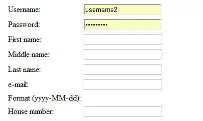
In a grid, columns can grow and shrink to fill up available space, and do this proportional to the content widths of each column. See the <span> part of the example below.
I would like to make <input> columns grow and shrink too, in exactly the same way the <span>s do.
.grid {
  display: grid;
  grid-template-columns: repeat(2, auto);
  width: 300px;
}

.column {
  border: 1px solid gray;
  overflow: hidden;
  text-overflow: ellipsis;
  white-space: nowrap;
}
<h3>span</h3>
<div class="grid">
<span class="column" contenteditable></span>
<span class="column" contenteditable></span>
</div>
<h3>input</h3>
<div class="grid">
<input class="column" type="text">
<input class="column" type="text">
</div>Current behaviour:
Wanted behaviour:
The fact that the columns should change size depending on the ratio between the two columns' widths is the most important goal (in the demo, the <span>s already do this)
I have tried setting min-width and width of the inputs based on the HTML-width of their value, calculated using the createElement method here. But when min-width or width are set, the size of the input can't be changed by the grid anymore, instead the grid resizes columns over the top of the input and the ellipses never show.
I think setting widths is the wrong way to do this anyway, can CSS figure out how much content an input has?

