2

I have an img inside a picture styled with rounded corners and a drop shadow:

img {
  border-radius: 22%;
  filter: drop-shadow(0px 0px 1px rgba(0, 0, 0, 0.75));
}
<picture>
  <source type="image/webp" srcset="https://cdn.crispedge.com/c78b95.webp" />
  <source type="image/png" srcset="https://cdn.crispedge.com/c78b95.png" />
  <img width="100" height="100" src="https://cdn.crispedge.com/c78b95.png" />
</picture>

When first loaded in Safari (mobile or desktop) the shadow will only show on the corners, as shown below:

enter image description here

When the page is refreshed (or loaded in other browsers) the shadow is shown all around the image:

enter image description here

I had a JSFiddle that demonstrates this: https://jsfiddle.net/s0dy5jwa/17/show

I see even stranger results when using multiple elements. For example the following will be missing the drop shadow on the top of the first image and the bottom of the last image.

<code>img</code> inside <code>picture</code>
<br/>
<picture>
  <img width="100" height="100" src="https://cdn.crispedge.com/c78b95.png" />
</picture>
<br/>
Just an <code>img</code> with PNG
<br/>
<img width="100" height="100" src="https://cdn.crispedge.com/c78b95.png" />
<br/>
Just an <code>img</code> with WebP
<br/>
<img width="100" height="100" src="https://cdn.crispedge.com/c78b95.webp" />

enter image description here

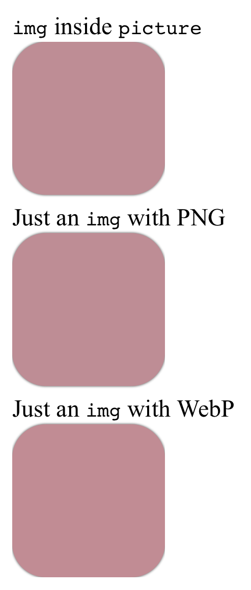
Demo: https://jsfiddle.net/s0dy5jwa/22/show

I've seen the same bug when using a mask to round the image so it seems to occur whenever the shape of the element changes.

Can this bug be worked around?

Joseph Duffy
  • 4,566
  • 9
  • 38
  • 68

2 Answers2

3

I ran into a similar problem. I have searched and found many different solutions. Safari seems to render filter:drop-shadow not correctly on elements using border-radius. Now I found out that in your case, the problem was not connected to this bug. overflow:visible is missing on your img-elements.

img {
  border-radius: 22%;
  filter: drop-shadow(0px 0px 10px rgba(0, 0, 0, 0.75));
  overflow: visible;
}

https://jsfiddle.net/s0dy5jwa/22/

But in my case, drop-shadow was still getting cut off by the parenting div. Strangely it rendered randomly correct or cut off on reload. For me what finally worked was this:

-webkit-appearance: none;
-moz-appearance: none;
appearance: none;

And i had to group my images and using drop-shadow on the parent, like in this example: https://twitter.com/joshwcomeau/status/1407811337984647169

Here's a similar solution with code: Why is filter(drop-shadow) causing my SVG to disappear in Safari?

If it's still not rendering correctly, be sure to prefix it (-webkit-filter:drop-shadow) or try using ems instead of px.

  • I tried both of your suggestions but the shadow is still clipped. Do you have a more complete example? – Joseph Duffy Jan 18 '22 at 02:23
  • I edited my initial answer. Your problem wasn't related to the safari bug. – Tobias Wirz Jan 20 '22 at 09:18
  • I must be missing something, can you post a full example? Moving the `filter` to the container, adding `overflow: visible`, `appearance: none`, and `-webkit-filter` (https://jsfiddle.net/923ga6Ld/7/show) doesn't fix it. https://imgur.com/xUQk8ef – Joseph Duffy Jan 28 '22 at 19:46
0

give some padding.this have worked for me

  • Your answer could be improved with additional supporting information. Please [edit] to add further details, such as citations or documentation, so that others can confirm that your answer is correct. You can find more information on how to write good answers [in the help center](/help/how-to-answer). – Community Apr 18 '23 at 09:51