I'm trying to implement a dialogFragment with custom layout in Jetpack compose but can't find any samples. Do I need to wrap the UI components inside a Card/Surface and then wrap that inside a Dialog? Can't find any examples in the documentation, all the samples are about Alert dialogs but I need to customise the layout. Thanks.
Asked
Active
Viewed 6,349 times
8
AndroidDev
- 5,193
- 5
- 37
- 68
-
https://stackoverflow.com/questions/68852110/show-custom-alert-dialog-in-jetpack-compose – audient Feb 11 '22 at 07:36
-
I was after a DialogFragment and not an AlertDialog – AndroidDev Feb 11 '22 at 09:49
3 Answers
9
You can use the Dialog composable:
Dialog(
    onDismissRequest = { /* ... */ },
    DialogProperties(dismissOnBackPress = true, dismissOnClickOutside = false)
) {
    /* Your custom layout */
}
Gabriele Mariotti
- 320,139
- 94
- 887
- 841
-
-
@AndroidDev Yes. Just use in the content something like: `Surface(modifier= Modifier.size(150.dp), shape = RoundedCornerShape(8.dp)){}` – Gabriele Mariotti Sep 17 '21 at 12:56
-
Looks like you need to implement the dismiss call in onDismissRequest. Do you have example? – Arst Apr 18 '22 at 01:45
1
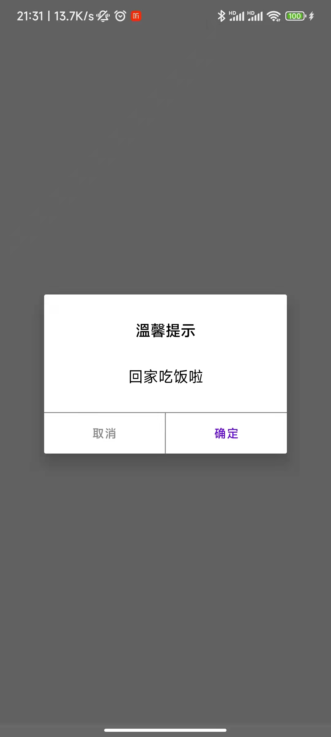
package com.rejia.manage.module.xiangshan

import android.os.Bundle
import android.view.LayoutInflater
import android.view.View
import android.view.ViewGroup
import android.view.Window
import android.widget.Toast
import androidx.compose.foundation.background
import androidx.compose.foundation.layout.*
import androidx.compose.foundation.shape.RoundedCornerShape
import androidx.compose.material.Text
import androidx.compose.material.TextButton
import androidx.compose.ui.Modifier
import androidx.compose.ui.graphics.Color
import androidx.compose.ui.platform.ComposeView
import androidx.compose.ui.text.font.FontWeight
import androidx.compose.ui.text.style.TextAlign
import androidx.compose.ui.unit.dp
import androidx.compose.ui.unit.sp
import androidx.fragment.app.DialogFragment

class TestDialogFragment : DialogFragment() {

    override fun onCreateView(inflater: LayoutInflater, container: ViewGroup?, savedInstanceState: Bundle?): View? {
        dialog!!.requestWindowFeature(Window.FEATURE_NO_TITLE)
        return ComposeView(requireContext()).apply {
            setContent {
                Column(modifier = Modifier.fillMaxWidth()) {
                    Text(
                        text = "溫馨提示",
                        textAlign = TextAlign.Center,
                        fontSize = 18.sp,
                        fontWeight = FontWeight.Bold,
                        modifier = Modifier
                            .fillMaxWidth()
                            .padding(30.dp),
                    )
                    Text(
                        text = "回家吃饭啦",
                        textAlign = TextAlign.Center,
                        fontSize = 18.sp,
                        modifier = Modifier
                            .fillMaxWidth()
                            .padding(start = 30.dp, end = 30.dp, bottom = 30.dp),
                    )

                    Row(
                        modifier = Modifier
                            .background(Color.Gray)
                            .padding(top = 1.dp)
                            .background(Color.White)
                            .height(48.dp)
                    ) {
                        TextButton(
                            shape = RoundedCornerShape(0.dp),
                            modifier = Modifier
                                .fillMaxHeight()
                                .weight(1F),
                            onClick = {
                                Toast.makeText(requireContext(), "onCancelClick", Toast.LENGTH_SHORT).show()
                            },
                        ) {
                            Text(text = "取消", color = Color.Gray)
                        }
                        Spacer(
                            modifier = Modifier
                                .width(1.dp)
                                .fillMaxHeight()
                                .background(Color.Gray)
                        )
                        TextButton(
                            shape = RoundedCornerShape(0.dp),
                            modifier = Modifier
                                .fillMaxHeight()
                                .weight(1F),
                            onClick = {
                                Toast.makeText(requireContext(), "onConfirmClick", Toast.LENGTH_SHORT).show()
                            },
                        ) {
                            Text(text = "确定")
                        }
                    }
                }
            }
        }
    }
}
TestDialogFragment().show(parentFragmentManager, "TestDialogFragment")
audient
- 19
- 2
0
Pass a composable into the text field when composing the AlertDialog. The parameter text consumes a composable where you can layout whatever you want as a normal composable.
@Composable
fun AlertDialog(
    onDismissRequest: (() -> Unit)?,
    confirmButton: (@Composable () -> Unit)?,
    modifier: Modifier? = Modifier,
    dismissButton: (@Composable () -> Unit)? = null,
    title: (@Composable () -> Unit)? = null,
    text: (@Composable () -> Unit)? = null,
    shape: Shape? = MaterialTheme.shapes.medium,
    backgroundColor: Color? = MaterialTheme.colors.surface,
    contentColor: Color? = contentColorFor(backgroundColor),
    properties: DialogProperties? = DialogProperties()
): Unit
The source code can be found here: