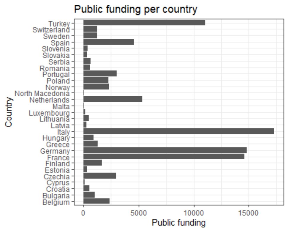
I am new to R programming and got stuck during one of my assignments. I have a data frame, of which I wish to visualise one column with values and one column with country names. The graph type will be a bar chart. So far so good, I was able to make this work on my own. The code is as follows:
library(tidyverse)

df_a <- read.csv(file = "inn_cis10_pub.csv", head = TRUE, sep = ";")

df_a %>%
  drop_na(Public.funding) %>%
  ggplot(aes(GEO.SRC_FUND, Public.funding))+
  geom_bar(stat='identity')+
  coord_flip()+
  theme_bw()+
  labs(y = "Public funding",
       x = "Country",
       title = "Public funding per country")
The result I get is exactly what I want (https://i.gyazo.com/13bc4cf81879dbf397664e6c82f09039.png). However, there is one problem: the bar chart is ordered by alphabet based on the country names and I want them to be sorted based on the values ("the funding"). I found that I can use the fct_infreq function for that, but the sources that I've seen so far have not really been helpful as I couldn't find where I have to put it in my code. I would really appreciate it if someone could give me a tip in the right direction. Thanks in advance!