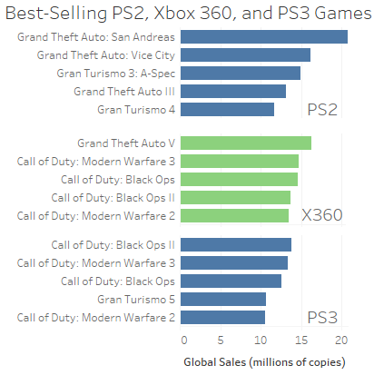
A simple approach to achieve your desired result would be to make use of facet_wrap(~Publisher, scales = "free_y", ncol = 1, strip.position = "right") which will put all publishers in one column, shows only the games per publisher and puts the script text on the right.
Note: To make the example both minimal and reproducible I used only the top 3 publishers and the top 4 games and added the data via dput(df2) See how to make a minimal reproducible example.
library(ggplot2)

ggplot(df2, aes(x = Name, y = Sales)) +
  geom_bar(stat = "identity") +
  facet_wrap(~Publisher, scales = "free_y", ncol = 1, strip.position = "right") +
  coord_flip() +
  labs(x = "Game", y = "Total Sales (millions of copies)")

To get more closer to the chart you posted as a link you could reorder the Publishers by sales and make use of tidy text::reorder_within + tidy text::scales_y_reorderd to order Name by Sales per Publisher, make use of geom_text to put the publisher's name on the plot which allows to get rid of the strip texts and some additional styling.
Note: To simplify the code I make use of geom_col which is short for geom_bar(stat = "identity") and switched the role of x and y to get rid of the coord_flip:
library(dplyr)
library(tidytext)

df2 <- df2 %>%
  mutate(
    Publisher = reorder(Publisher, -Sales),
    Name = tidytext::reorder_within(Name, Sales, Publisher, fun = sum)
  ) %>%
  group_by(Publisher) %>%
  mutate(y_label = Name[Name == last(Name)],
         label = ifelse(Name %in% y_label, as.character(Publisher), ""))

ggplot(df2, aes(x = Sales, y = Name, fill = Publisher)) +
  geom_col() +
  geom_text(aes(x = max(Sales), y = y_label, label = label), hjust = 1) +
  tidytext::scale_y_reordered() +
  scale_x_continuous(expand = expansion(mult = c(0, .05))) +
  facet_wrap(~Publisher, scales = "free_y", ncol = 1) +
  labs(x = "Total Sales (millions of copies)", y = "Game") +
  guides(fill = "none") +
  theme_minimal() +
  theme(
    strip.text = element_blank(),
    panel.grid.major.y = element_blank(),
    panel.grid.minor = element_blank()
  )

DATA
df2 <- structure(list(Publisher = c(
  "Nintendo", "Nintendo", "Nintendo",
  "Nintendo", "Electronic Arts", "Electronic Arts", "Electronic Arts",
  "Electronic Arts", "Activision", "Activision", "Activision",
  "Activision"
), pubttlsale = c(
  1788.81, 1788.81, 1788.81, 1788.81,
  1116.96, 1116.96, 1116.96, 1116.96, 731.16, 731.16, 731.16, 731.16
), Name = c(
  "Wii Sports", "Super Mario Bros.", "Mario Kart Wii",
  "Wii Sports Resort", "FIFA 16", "FIFA Soccer 13", "The Sims 3",
  "Star Wars Battlefront (2015)", "Call of Duty: Modern Warfare 3",
  "Call of Duty: Black Ops 3", "Call of Duty: Black Ops", "Call of Duty: Black Ops II"
), Sales = c(
  82.53, 40.24, 35.52, 32.77, 8.57, 8.16, 8.01, 7.98,
  14.73, 14.63, 14.61, 13.79
)), class = c("tbl_df", "tbl", "data.frame"), row.names = c(NA, -12L))