0

I am trying to skip NA values on a graph with two lines on it (ad13com & Pd13c), and combining it with a second graph (xPDd13C) using grid arrange. Using my code, the line breaks due to NA values in my data and I am looking for continuous lines (three separate ones). I have tried using na.rm arguments but didn't make any progress as I'm quite new to r. I realise that the issue is coming from the fact that I am plotting the ungathered data but I don't know how to apply a skip NA argument to data thats being plotted this way!

In my code, I first gather the data before plotting it as I am using a similar script for when I produced multiple plots using facet wrap, so it may not be necessary to gather the data for this application? I also realise I have multiple y axis scales so it just replaces the existing scale and uses the last one, I wasn't too sure how to remove it properly so I just left it in as it works fineFailed Graph Excel Data
Anyway here is my code:

theme_set(theme_paleo(8))
theme_update(plot.title = element_text(hjust = 0.5))

#read the data
data <- read_csv("profundal.csv", col_types = cols(.default = col_guess())
)

#first gather the data and set out the omit na function in order to skip na values
data %>% filter(core_id == "BKM0817") %>%
  gather(key = param, value = value, -core_id, -Age, -depth) %>% 
  na.omit()

#plot the first graph
prof1 <- 
  ggplot() +
  geom_lineh(data = data, mapping = aes(x=ad13com, y = Age), colour = "black", size = 1) +
  geom_point(data = data, mapping = aes(x=ad13com, y = Age), colour = "black", size = 2) +
  geom_lineh(data = data, mapping = aes(x=Pd13c, y = Age), linetype = 2, colour = "black", size = 1,) +
  geom_point(data = data, mapping = aes(x=Pd13c, y = Age), shape=0, colour = "black", size = 2.7) +
  scale_y_reverse() +
  labs (x = expression(delta ^13*"C (\u2030 V-PDB)"), y = "Age (Cal. yrs BP)") +
  ggtitle(expression(delta ^13*"C"[OM]~"and Chironomus")) +
  theme(panel.border = element_blank(), panel.grid.major = element_blank(),
        panel.grid.minor = element_blank(), axis.line = element_line(colour = "black"))

#plot the second graph
prof2 <- 
  ggplot() +
  geom_lineh(data = data, mapping = aes(x=xPDd13C, y = Age), colour = "black", size = 1) +
  geom_point(data = data, mapping = aes(x=xPDd13C, y = Age), shape = 2, colour = "black", size = 2) +
  scale_y_reverse(# Features of the first axis
    name = "Age (Cal. yrs BP)",
    
    # Add a second axis and specify its features
    sec.axis = sec_axis( trans=~./17.927, name="Depth (cm)")
  ) +
  labs(x = expression(delta ^13*"C (\u2030 V-PDB)"), y = "Age (Cal. yrs BP)") +
  ggtitle( expression(Delta*delta ^13*"C")) +
  theme(panel.border = element_blank(), panel.grid.major = element_blank(),
        panel.grid.minor = element_blank(), axis.line = element_line(colour = "black"))

#combine the plots
profundal <-gridExtra::grid.arrange(
  prof1,
  prof2 + 
    labs(y = NULL) +
    scale_y_reverse(labels = NULL, name = "Age (Cal. yrs BP)",
                    
                    # Add a second axis and specify its features
                    sec.axis = sec_axis( trans=~./17.927, name="Depth (cm)")) +
    theme(
      plot.margin = unit(c(0.05,0.1, 0.056,0), "inches"),
      axis.ticks.y = element_blank(),
      plot.background = element_blank()
    ),
  nrow = 1,
  widths = c(4, 4)
)

# save the file 
ggsave("test.png", units="in", width=8, height=6, dpi=300, plot=profundal)

Many thanks in advance!
KyleWeston
  • 23
  • 3
  • 3
    Please don't post images of data, codes , ... for these [reasons](https://meta.stackoverflow.com/questions/285551/why-not-upload-images-of-code-errors-when-asking-a-question/285557#285557). If you want to post data type `dput(NAME_OF_DATASET)` into the console and copy & paste the output starting with `structure(....` into your post. If your dataset has a lot of observations you could do e.g. `dput(head(NAME_OF_DATASET, 20)).` See [how to make a minimal reproducible example](https://stackoverflow.com/questions/5963269/how-to-make-a-great-r-reproducible-example). – stefan Oct 09 '21 at 16:35

2 Answers2

1

Where you have used na_omit() on data the results are not assigned to anything. You need to assign the results to data (or something else).

data <- data %>% filter(core_id == "BKM0817") %>%
  gather(key = param, value = value, -core_id, -Age, -depth) %>% 
  na.omit()
Tjn25
  • 685
  • 5
  • 18
  • Thanks Tjn. I tried this with just the first graph (prof1). However, it returns error: Error in FUN(X[[i]], ...) : object 'ad13com' not found. The new dataset post from gathering: the NAs are successfully omitted. However, the parameters I want to plot are now stacked as parameters so I think its not identifying them with the x = in the geom function. I am looking into using the subset function to do select the rows of data to plot individually (e.g. subset data ad13com and plot that, then subset data Pd13c and plot that separately but on the same graph). Might post another Q with eg data. – KyleWeston Oct 10 '21 at 07:13
  • It's hard to offer help when the data is provided as an image. See stefans's comment on your original question. – Tjn25 Oct 11 '21 at 01:38
-1

I managed to plot the new data after it was gathered (as Tjn suggested with the na.omit function at the end) like this.

data2 <- data %>% filter(core_id == "BKM0817") %>%
  gather(key = param, value = value, -core_id, -Age, -depth) %>% 
  na.omit()

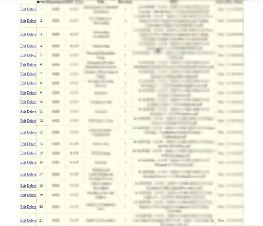
The data then looks like this: Gathered data (data2)

In order to plot two lines on the same graph, I then had to subset the data and plot the lines and points individually like this for the first graph and follows the same structure for the second graph:

prof1 <-
  ggplot() +
  geom_lineh(data = subset(data2,param %in% "ad13com"), mapping = aes(x=value, y = Age), colour = "black", size = 1) +
  geom_point(data = subset(data2,param %in%"ad13com"), mapping = aes(x=value, y = Age), colour = "black", size = 2) +
  geom_lineh(data = subset(data2,param %in% "Pd13c"), mapping = aes(x=value, y = Age), linetype = 2, colour = "black", size = 1,) +
  geom_point(data = subset(data2,param %in% "Pd13c"), mapping = aes(x=value, y = Age), shape=0, colour = "black", size = 2.7) +
  scale_y_reverse() +
  labs (x = expression(delta ^13*"C (\u2030 V-PDB)"), y = "Age (Cal. yrs BP)") +
  ggtitle(expression(delta ^13*"C"[OM]~"and Chironomus")) +
  theme(panel.border = element_blank(), panel.grid.major = element_blank(),
        panel.grid.minor = element_blank(), axis.line = element_line(colour = "black"))

The final result is now the same as the graph in the question but now with lines linking all the points individually.

KyleWeston
  • 23
  • 3