5

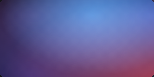
I'm trying to replicate the following gradient in CSS:

enter image description here

The best I've managed to do is:

background:
  radial-gradient(ellipse at 20% 20%, #35234b 0%, transparent 70%),
  radial-gradient(ellipse at 60% 20%, #2975bf 0%, transparent 70%),
  radial-gradient(ellipse at 100% 20%, #3d54b1 0%, transparent 70%),
  radial-gradient(ellipse at 100% 100%, #9f3c54 0%, transparent 70%),
  radial-gradient(ellipse at 20% 100%, #362d6f 0%, transparent 70%);
background-blend-mode:screen;

which isn't that close:

enter image description here

Is it possible to get even closer to the gradient in the image? (It doesn't have to be CSS, Javascript is also valid, or even an external library. But pure CSS is preferred.)

body {
  height: 100vh;
  width: 100vw;
  margin: 0;
  padding: 0;
  background:
    radial-gradient(ellipse at 20% 20%, #35234b 0%, transparent 70%),
    radial-gradient(ellipse at 60% 20%, #2975bf 0%, transparent 70%),
    radial-gradient(ellipse at 100% 20%, #3d54b1 0%, transparent 70%),
    radial-gradient(ellipse at 100% 100%, #9f3c54 0%, transparent 70%),
    radial-gradient(ellipse at 20% 100%, #362d6f 0%, transparent 70%);
  background-blend-mode:screen;
}
étale-cohomology
  • 2,098
  • 2
  • 28
  • 33

2 Answers2

2

You were really close, start anticlockwise from the left bottom color,
and don't use mix-blend mode- to get rid of artifacts.

body {  
  font: 16px/1.4 sans-serif; letter-spacing: 0.12em;
  min-height: 150vh;
  padding: 2em;
  margin: 0;
  color: hsla(0, 0%, 100%, 0.85); 
  
  background-color: #170d24;
  background-image:
    radial-gradient(ellipse at 10% 90%, #3c2d83 0%, transparent 55%),
    radial-gradient(ellipse at 90% 90%, #c33c65 0%, transparent 55%),
    radial-gradient(ellipse at 90% 10%, #4a74dc 0%, transparent 55%),
    radial-gradient(ellipse at 10% 10%, #35244f 0%, transparent 55%);
}
<b>ETHEREUM</b> 2.0
<h1>Your Gateway<br>into Blockchain</h1>
<p>Scroll down... and to the moon!</p>
Roko C. Buljan
  • 196,159
  • 39
  • 305
  • 313
  • 1
    Beautiful solution. (I added a `radial-gradient(ellipse at 70% 10%, #2975bf 0%, transparent 55%)` for the top mid color, not sure if it's needed) – étale-cohomology Oct 12 '21 at 02:55
1

Thanks to Temani Afif's suggestion I came up with the following. Still not exact, but way closer than before. If anyone wants to improve on this, it's very much welcome.

body {
  height: 100vh;
  width: 100vw;
  margin: 0;
  padding: 0;
  background:linear-gradient(to right, #35234b 0% 10%,#2975bf 60% 70%,#3d54b1 80% 100%);
}

body::before{
  content:""; display:block; height:100%;
  background:linear-gradient(to right, #362d6f,#9f3c54);
  -webkit-mask:linear-gradient(to bottom,transparent, #fff); 
  mask:linear-gradient(to bottom,transparent, #fff);
}
étale-cohomology
  • 2,098
  • 2
  • 28
  • 33