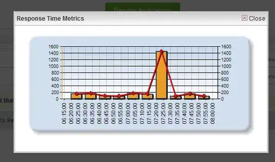
I'm trying to create a histogram which will be identical to this 
My csv file contains 2 columns named Value & Count. I found similar posts but I couldn't achieve results as the above image attached. My problem is that the y-axis doesn't have values like the above image attached. Also, how can I set the x-axis to get values from the column Value? Could you please help me? Here is the code:
test_csv = read.csv("dir/k.csv")

plot(k$Count, log="y", type='h', lwd=10, lend=2)
Here's my data:
test_csv = dput(k)
structure(list(Value = 1:101, Count = c(8512998L, 2524797L, 408468L,
141472L, 72906L, 43135L, 29530L, 21288L, 16890L, 13181L, 10935L,
8941L, 7883L, 6677L, 5995L, 5259L, 4802L, 4124L, 3912L, 3411L,
3228L, 2761L, 2690L, 2335L, 2200L, 1878L, 1792L, 1586L, 1520L,
1219L, 1232L, 1087L, 1027L, 895L, 845L, 761L, 781L, 712L, 676L,
614L, 578L, 506L, 476L, 452L, 438L, 394L, 373L, 345L, 325L, 348L,
320L, 257L, 260L, 219L, 227L, 213L, 177L, 182L, 170L, 151L, 135L,
127L, 118L, 116L, 123L, 96L, 115L, 69L, 72L, 78L, 70L, 63L, 60L,
64L, 67L, 50L, 63L, 64L, 63L, 49L, 53L, 45L, 48L, 48L, 40L, 56L,
28L, 44L, 40L, 32L, 22L, 18L, 30L, 18L, 23L, 15L, 27L, 22L, 22L,
21L, 10L)), class = "data.frame", row.names = c(NA, -101L))
