0

I am trying to recreate this website: Fister.
But my pictures won't align.

<html>
  <head>
    <meta charset="utf-8">
    <!-- CSS only -->
<link href="https://cdn.jsdelivr.net/npm/bootstrap@5.1.3/dist/css/bootstrap.min.css" rel="stylesheet" integrity="sha384-1BmE4kWBq78iYhFldvKuhfTAU6auU8tT94WrHftjDbrCEXSU1oBoqyl2QvZ6jIW3" crossorigin="anonymous">
<link rel="icon" href="124010.png">
    <title>FacebookMusic</title>
  </head>
  <body>
<div class="container">

  <div class="row">
 
    <div class="col">
      <img class="img-responsive" src="dF5SId3UHWd.svg">
    </div>

    <div class="col">
      <img class="img-responsive" src="bg.png">
    </div>
 
  </div>
</div>
  </body>
</html> 

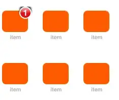
In this picture you can see my result:

my result

I need the picture with the girl on the right,

Can someone help me? I am a beginner.

isherwood
  • 58,414
  • 16
  • 114
  • 157

2 Answers2

0

Just Use Below css

img {
    max-width: 100%;
}

img{
  max-width:100%;
}
<html>
  <head>
    <meta charset="utf-8">
    <!-- CSS only -->
<link href="https://cdn.jsdelivr.net/npm/bootstrap@5.1.3/dist/css/bootstrap.min.css" rel="stylesheet" integrity="sha384-1BmE4kWBq78iYhFldvKuhfTAU6auU8tT94WrHftjDbrCEXSU1oBoqyl2QvZ6jIW3" crossorigin="anonymous">
<link rel="icon" href="124010.png">
    <title>FacebookMusic</title>
  </head>
  <body>
<div class="container">

  <div class="row">
 
    <div class="col">
      <img class="img-responsive" src="https://i.stack.imgur.com/M9OxW.png" alt="image1">
    </div>

    <div class="col">
      <img class="img-responsive" src="https://i.stack.imgur.com/LgiGe.png" alt="image2">
    </div>
 
  </div>
</div>
  </body>
</html> 
Jignesh Panchal
  • 1,037
  • 11
  • 29
  • Custom CSS is not necessary with Bootstrap, which has its own image class (`img-fluid`). You wouldn't want to apply that CSS to _all_ image elements, either. – isherwood Oct 12 '21 at 14:08
  • Also, you're loading Bootstrap 5, but version 4 is tagged. – isherwood Oct 12 '21 at 14:15
  • @isherwood Yes But in some cases we can not add class in img tag. When its uploaded from backend side like WordPress etc. So I think this is the best practice to add this in common CSS. – Jignesh Panchal Oct 12 '21 at 14:15
0

Apply the img-fluid class to your images to make them respect the grid. You may have been following docs for Bootstrap 3, which had the class you used.

https://getbootstrap.com/docs/4.5/content/images/#responsive-images

<link rel="stylesheet" href="https://cdn.jsdelivr.net/npm/bootstrap@4.6.0/dist/css/bootstrap.min.css" integrity="sha384-B0vP5xmATw1+K9KRQjQERJvTumQW0nPEzvF6L/Z6nronJ3oUOFUFpCjEUQouq2+l" crossorigin="anonymous">

<div class="container">
  <div class="row">
    <div class="col">
      <img class="img-fluid" src="https://i.stack.imgur.com/M9OxW.png" alt="image1">
    </div>

    <div class="col">
      <img class="img-fluid" src="https://i.stack.imgur.com/LgiGe.png" alt="image2">
    </div>
  </div>
</div>
isherwood
  • 58,414
  • 16
  • 114
  • 157