0

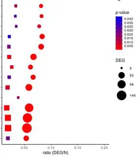
I am trying to create a dotplot in ggplot, were the scale colour represents the p-value of the data set, but it is not behaving as I expect. The max and min limits of this scale colour are so far in units (from 0.04 to 8e-17). So it is only showing from 0.04 to 0.005 and every dot with lower p-value will have the same colour as 0.005.

I tried this, but the plot still doesn't adjust to the manual limits: A dotplot from my data here:

enter image description here

myPalette <- colorRampPalette(c("red", "blue"))
sc <- scale_colour_gradientn(colours = myPalette(100), limits=c(min(data$`p-value`),max(data$`p-value`)), n.breaks = 10)

p + sc

Is there a max distance that can exist between max and min in the limits for scale_colour_gradientn ? Should I use another way to create the scale ? How can I solve this ?

Thanks in advance, Miriam
KoenV
  • 4,113
  • 2
  • 23
  • 38
  • You could improve your chances of finding help here by adding a [minimal reproducible example](https://stackoverflow.com/questions/5963269/how-to-make-a-great-r-reproducible-example/5963610#5963610). Adding a MRE and an example of the desired output makes it much easier for others to find and test an answer to your question. That way you can help others to help you! P.S. Here is [a good overview on how to ask a good question](https://stackoverflow.com/help/how-to-ask) – dario Oct 19 '21 at 08:49
  • 1
    A common transformation for displaying p-values is `-log10(pvalue)`. This will give very small/significant p-values a larger value than insignificant ones. – teunbrand Oct 19 '21 at 08:52
  • Thank you, that's a nice idea actually ! – Miriam Riquelme Pérez Oct 19 '21 at 09:24
  • May we see an example of your dataset and sample of the code for `p` that can reproduce a plot? To share the dataframe, type `dput(your_df_name)` into the console and copy and paste that output as code into your question. Alternatively, you can share a sample or few rows of that data frame that can demonstrate the issue if it's too large to post the complete set. Additionally, code for the rest of your plot would be useful here. My understanding is that you are expecting the red circles to be more colors than just red? – chemdork123 Oct 19 '21 at 12:19

0 Answers0