0

I have a layout as follows,

enter image description here

container - to hold all the cards.

card - div for containing information.

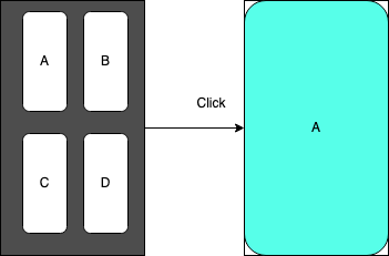
In the above Image, the left one shows the initial rendering of the screen, When user clicks on any inner card, the corresponding card should popout/zoomout,

and when user click backs on pop up card, it should disappear and the first sceen should display.

The popup animation should be like that, it should start from the position of the card, we have clicked.

The popup close animation after second click(When popup is open), the animation should look like that, the popup should get minimized to the card clicked in the first step.

I have tried following code, but it is really animating..

let isOpen = false;

$(".child").on("click", function() {
  if (!isOpen) {
    $(".child").removeClass("active");
    $(this).addClass("active");
    isOpen = true;
  } else {
    $(this).removeClass("active");
    isOpen = false;
  }
})
* {
  box-sizing: border-box;
}

.parent {
  margin: 40px auto;
  width: 400px;
  height: 600px;
  border: 1px solid #3b3b3b;
  border-radius: 20px;
  padding: 20px 40px;
  position: relative;
  display: grid;
  grid-template-columns: repeat(2, 1fr);
  gap: 20px;
}

.child {
  display: flex;
  justify-content: center;
  align-items: center;
  border: 1px solid #000;
  border-radius: 40px;
  cursor: pointer;
  transition: all 0.5s ease-in;
}

.child.active {
  width: 100%;
  height: 100%;
  position: absolute;
  top: 0;
  left: 0;
  z-index: 10;
  border: 1px solid red;
  background: #000;
  border-radius: 20px;
  color: #fff;
}

@keyframes zoomIn {
  0% {
    transform: scale(1.1);
  }
  50% {
    transform: scale(1.2);
  }
  100% {}
}
<script src="https://cdnjs.cloudflare.com/ajax/libs/jquery/3.3.1/jquery.min.js"></script>
<div class="parent">
  <div class="child">1</div>
  <div class="child">2</div>
  <div class="child">3</div>
  <div class="child">4</div>
</div>

Please help me to simulate the same.

Anil
  • 1,748
  • 8
  • 32
  • 67

2 Answers2

2

Your animation is pretty much complete. The problem as I see it is that when the .active class is added to a child, the other children fill up the void in the grid. This makes the active child not enlarge from its original position.

I made my own solution using CSS but without animations - and vanilla JavaScript. In my code (just as in yours) the child gets lose from the grid, gets an absolute position and then fills up the entire parent container with width: 100%; and height: 100%; I also added CSS specifications to the other children to stay put when this is happening (see below).

It's a rather snappy effect because transition is not applied to width and height unless the child is absolute positioned before the active class is added. To achieve a more "zoomy" effect is a bit more tricky:

  • You can observe for DOM attribute (class) mutations with JavaScript (in other words, add a class with absolute positioning, and when that operation is completed, add another class with width: 100%; and height: 100%;).
  • Or you could use position: absolute on all the child elements from the start, but then you also need to specify width, height, top, left etc.
  • Some other solution I'm too tired or not skilled enough to think of.

Current Solution

// Turn all 4 .child selectors into an integer array ranging from 0-3
let cardArray = Array.from(document.querySelectorAll(".child"));

// Loop over each integer [0-3] and give them an index number
// Listen for clicks, and then toggle the "larger" class onto the item with the corresponding index number [0-3]
cardArray.forEach(function(everyItem, index) {

    everyItem.addEventListener("click", function() {
        cardArray[index].classList.toggle("larger");

    });

});
* {
    box-sizing: border-box;
}

.parent {
    margin: 40px auto;
    width: 400px;
    height: 600px;
    border: 1px solid #3b3b3b;
    border-radius: 20px;
    padding: 20px 40px;
    display: grid;
    grid-template-columns: repeat(2, 1fr);
    grid-gap: 20px;
    transition: all 0.5s;
    
    /* relative position required for enlarged items to stay within parent container */
    position: relative; 
}

.child {
    display: flex;
    justify-content: center;
    align-items: center;
    border: 1px solid #000;
    border-radius: 40px;
    cursor: pointer;
    transition: all 0.2s;
    
    /* z-index not neccessary, just a precaution */
    z-index: 1;
}

/* top/bottom/left/right required for the CURRENTLY ACTIVE child to resize from the correct corner.
:nth-child() with grid-area specified required for NOT CURRENTLY active children to stay put in grid. */
.child:nth-child(1) {
    grid-area: 1 / 1;
    top: 0;
    left: 0;
}

.child:nth-child(2) {
    grid-area: 1 / 2;
    top: 0;
    right: 0;
}

.child:nth-child(3) {
    grid-area: 2 / 1;
    bottom: 0;
    left: 0;
}

.child:nth-child(4) {
    grid-area: 2 / 2;
    bottom: 0;
    right: 0;
}

/* .larger class added with the help 
of JavaScript on click */
.child.larger {

    /* Unhinge from the grid */
    grid-area: unset;
    
    /* Position absolute in order to resize it */
    position: absolute; 
    
    /* Fill the WIDTH of the parent container */
    width: 100%;
    
     /* Fill the HEIGHT of the parent container */
    height: 100%;
    
    /* z-index not neccessary, just a precaution */
    z-index: 2; 
    background: #000;
    opacity: 0.5;
    color: #fff;
}
<div class="parent">
  <div class="child">1</div>
  <div class="child">2</div>
  <div class="child">3</div>
  <div class="child">4</div>
</div>
abbeski
  • 21
  • 4
0

You can try achieve this with by css variables calculation, position: absolute and a separate .active class for each element.

let isOpen = false;
  
$('.child').on('click', function() {
  if (!isOpen) {
    $('.child').removeClass('active');
    $(this).addClass('active');
    isOpen = true;
  } else {
    $(this).removeClass('active');
    isOpen = false;
  }
});
*,
::after,
::before {
  margin: 0;
  padding: 0;
  box-sizing: border-box;
}

:root {
  --parent-width: 400px;
  --parent-height: 600px;
  --gap: 20px;
}
.parent {
  margin: 40px auto;
  width: var(--parent-width);
  height: var(--parent-height);
  border: 1px solid #3b3b3b;
  border-radius: 20px;
  position: relative;
}

.child {
  display: flex;
  justify-content: center;
  align-items: center;
  border: 1px solid #000;
  border-radius: 40px;
  cursor: pointer;
  transition: all 0.5s ease-in;
  position: absolute;
  height: calc((var(--parent-height) / 2) - (var(--gap) * 2));
  width: calc((var(--parent-width) / 2) - (var(--gap) * 3));
}

/* Init size */
.child:nth-child(1) {
  top: var(--gap); /* padding top 20px */
  left: calc(var(--gap) * 2); /* padding left 40px */
}
.child:nth-child(2) {
  top: var(--gap);
  right: calc(var(--gap) * 2); /* padding right 40px */
}
.child:nth-child(3) {
  bottom: var(--gap); /* padding bottom 20px */
  left: calc(var(--gap) * 2); /* padding left 40px */
}
.child:nth-child(4) {
  bottom: var(--gap);
  right: calc(var(--gap) * 2);
}

/* Full size */
.child:nth-child(1).active {
  top: 0;
  left: 0;
}
.child:nth-child(2).active {
  top: 0;
  right: 0;
}
.child:nth-child(3).active {
  bottom: 0;
  left: 0;
}
.child:nth-child(4).active {
  bottom: 0;
  right: 0;
}

.child.active {
  width: 100%;
  height: 100%;
  z-index: 10;
  border: 1px solid red;
  background: #000;
  border-radius: 20px;
  color: #fff;
}
<script src="https://cdnjs.cloudflare.com/ajax/libs/jquery/3.3.1/jquery.min.js"></script>
<div class="parent">
  <div class="child">1</div>
  <div class="child">2</div>
  <div class="child">3</div>
  <div class="child">4</div>
</div>
Anton
  • 8,058
  • 1
  • 9
  • 27