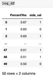
I have a model that I have trained and visualized, the problem is that I can't seem to find a way to graph the curve onto my plot
%matplotlib inline
import pandas as pd
from matplotlib import pyplot as plt

log_df = pd.read_csv("datalist/education/pollingData.csv")
X_train, X_test, y_train, y_test = train_test_split(log_df[['PercentYes']],log_df.side_val,test_size=0.2)

from sklearn.linear_model import LogisticRegression
model = LogisticRegression()
model.fit(X_train, y_train)
Y = model.predict(X_test)

plt.figure(1, figsize=(4, 3))
plt.clf()
plt.scatter(X_train, y_train, color="black", marker='+')
plt.plot(X_train, y, color='red')
If I add the last line of code I get an error saying:
ValueError: x and y must have same first dimension, but have shapes (40, 1) and (10,)
Without that last line I just get a graph with no s curve, how would I go about reshaping the dimensions of my x and y values
