I have a data frame, which after applying the melt function looks similar to:
 var       val
1 a 0.6133426
2 a 0.9736237
3 b 0.6201497
4 b 0.3482745
5 c 0.3693730
6 c 0.3564962
..................
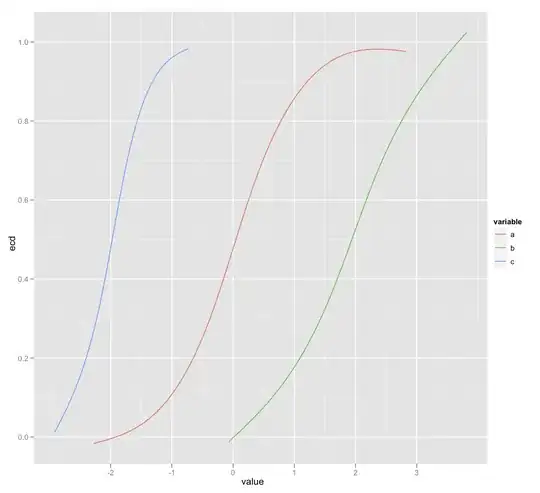
The initial dataframe had 3 columns with the column names, a,b,c and their associated values. I need to plot on the same graph, using ggplot the associated ecdf for each of these columns (ecdf(a),ecdf(b),ecdf(c)) but I am failing in doing this. I tried:
p<-ggplot(melt_exp,aes(melt_exp$val,ecdf,colour=melt_exp$var))
pg<-p+geom_step()
But I am getting an error :arguments imply differing number of rows: 34415, 0.
Does anyone have an idea on how this can be done? The graph should look similar to the one returned by plot(ecdf(x)), not a step-like one.
Thank you!