12

I'm still very much a CSS novice. For many years I've managed my layout using nested tables, which I know all CSS people would tell me is evil. I've piddled around with CSS for many years, but ever since the beginning I've been unable to make it control my layout the way I want it to.

In short, what I want is to have a <div> that will only be as wide as its contents. I do not want to set its size. I want it to be only as wide as its contents, which is created dynamically.

A table does this perfectly. With a <div> it always seems to do something other than what I want. No "overflow" option does what I want.

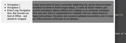
The classic example is when I want to create a full-page columnar layout with the left column containing navigation links and the right side containing the content. I want the left column to be precisely as wide as the navigation links. No more, no less. (The navigation links are not static; they're created dynamically and could change in size/length at any time). And the right ("content") column should be whatever's left over. Most importantly, when I make the browser screen wider or narrower, I want left column to STILL be exactly as wide as the nav-links: no more, no less. I want the contents to automatically wrap as needed, if the browser's width gets too narrow. Under no circumstances do I want the text to be obscured or to go outside of the defined column.

In short, I want a <div> that works as well as a table without having to use a table. Surely, CSS experts. this can be done....right? I've asked this question in other forums, and have never yet received an acceptable answer.

Or take a somewhat-related simple example like this (perhaps this one is easy):

<ul style="background: orange;">
   <li>one</li>
   <li>two</li>
   <li>three</li>
</ul>

The entire thing is as wide as the browser screen. But I want it to only be as wide as the longest element. How do I do this with CSS? I can put the entire thing inside a table like this

<table border=0 cellpadding=0 cellspacing=0><tr><td>
<ul style="background: orange;">
   <li>one</li>
   <li>two</li>
   <li>three</li>
</ul>
</td></tr></table>

...and it does what I want. How do I do this with CSS instead of using those "evil" tables?


I tried miku's example.
It doesn't work (for what I want it to do).

If I made the extra long navigation line a long string like

 an&nbps;extra&nbps;long&nbps;navigation&nbps;link&nbps;goes&nbps;here&nbps;-&nbps;this&nbps;could&nbps;even&nbps;be&nbps;an&nbps;image!

I want the left navigation side to expand as needed. I don't want a maximum width. Using the example above, the extra long line will be obscured by the "main" div.

Also, the "main" div should be the rest of the browser's width, and in this case it's only as wide as the text inside.

Brian Tompsett - 汤莱恩
  • 5,753
  • 72
  • 57
  • 129
Mike
  • 123
  • 3

4 Answers4

4

Not exactly sure about your question. I understand, that you want to have a dynamic left sidebar with a maximum width. If some text in the sidebar gets too long, it should be wrapped. Below is the code and a screenshot of how I imagine a solution:

  • Sidebar will be just as wide as the longest link (or something) in there (in the example below, there is a list in there)
  • If some content in the sidebar exceeds the maximum specified by the max-width property (here: 200px), it gets wrapped.
  • Main content takes up the remaining width.

Example A


Resizing the #main div (by resizing the browser window) works via overflow:hidden.

Example B


<html><head></head><body>

<div id="sidebar-left" 
    style="background:#EFEFEF; max-width:200px; float:left">
    <ul>
        <li>Navigation 1</li>
        <li>Navigation 2</li>
        <li>Extra Long Navigation item, 
            that exceeds our limit of 200px - and should be wrapped</li>
    </ul>
</div>

<div id="main" style="background:gray; overflow:hidden;">
    <p>Hello there - main content goes here</p>
</div>

</body></html>

If you don't want a max-sized sidebar, just drop the max-width attribute.

Community
  • 1
  • 1
miku
  • 181,842
  • 47
  • 306
  • 310
  • I believe the OP is actually looking for a minimum width on the navigation sidebar. – Chetan Aug 10 '11 at 17:41
  • 1
    you should extract the inline styles out to a CSS block as well. and I think he wanted the right content to wrap / max width as well – Bobby Borszich Aug 10 '11 at 17:43
  • @Bobby, I used inline style because this is just a *sketch*; if OP wants to limit the width of the main content area as well, he can apply the same `max-width` to `#main`. – miku Aug 10 '11 at 17:47
  • @miku good points ... not sure why some would downvote, seems to fit the bill best – Bobby Borszich Aug 10 '11 at 17:49
  • @Bobby, and if somebody has 2000+ rep, please feel free to improve my answer - I'd be happy about that. – miku Aug 10 '11 at 17:50
  • This is exactly what I was going to recommend doing. – Rob Aug 10 '11 at 18:15
  • I tried miku's example. It doesn't work (for what I want it to do). If I made the extra long navigation line a long string like an&nbps;extra&nbps;long&nbps;navigation&nbps;link&nbps;goes&nbps;here&nbps;-&nbps;this&nbps;could&nbps;even&nbps;be&nbps;an&nbps;image! I want the left navigation side to expand as needed. I don't want a maximum width. Using the example above, the extra long line will be obscured by the "main" div. Also, the "main" div should be the rest of the browser's width, and in this case it's only as wide as the text inside. – Mike Aug 10 '11 at 18:43
  • @Mike: OK, I fixed the *remaining* width of `#main` issue (via `overflow:hidden`). The fixed width can be dropped, if you don't need it. – miku Aug 10 '11 at 18:53
  • @miku that seems to work well except I don't want the overflow to be hidden. If the main (rightmost) column has a really wide line or image when I would expect it to make the column wider, forcing horizonal scroll (of the whole page) if necessary. I can't change that overflow:hidden to overflow:scroll because it would make only that inner/right div scrollable, not the whole page. – Mike Aug 10 '11 at 19:04
  • @Mike, I'm out of suggestions, sorry. To be honest, I don't really like horizontal scrollbars - so I have no real *drive* to investigate this further. Hope somebody can come up with a better answer. – miku Aug 10 '11 at 19:11
  • Nobody likes horizontal scrollbars, but if something were to happen with the dynamic data in the main/right column, to have the data clipped or appear outside the box is not acceptable. In a perfect world, the data should fit the box, but if not, I want the box to expand, and if the browser isn't wide enough, scrolling is required. – Mike Aug 10 '11 at 19:14
  • I appreciate your attempts, but it's sad to me that this is how it always seems to end up when I pose this question: without an answer. To me this is a basic layout question. Using nested tables may be "evil" but they always do exactly what I want. **But would would rather use CSS, since that's the current technology**. Is it simply that current technology cannot do what 1994 tables could do? – Mike Aug 10 '11 at 19:18
  • @Mike, I understand your concern. My approach would be to sanitize content, before it goes on stage, e.g. by 1) making columns before the rightmost column `max-width`'ed, 2) Shortening text or links, when too long, 3) cropping or resizing images, when they are too big, 4) wrap long lines without spaces programmatically by inserting breaks programmatically, and so on. – miku Aug 10 '11 at 19:18
  • @Mike, I tried to lure some designers in here*, I really like your question finally answered :) – * (http://www.reddit.com/r/Design/comments/jevtb/what_table_can_do_and_css_cant_in_search_for_a/) – miku Aug 10 '11 at 19:25
  • @Miku Thanks, but it boggles the mind that the "overflow" attribute doesn't have a value that tell is to expand the size of block. I'm having a hard time swallowing the fact that tables can still handle layout better thank CSS, but sadly, that seems to be the case. Again, thanks for your time. – Mike Aug 10 '11 at 19:26
  • Ugh, it just occurred to me that with the above layout, if I have a really_long_word_that_extends_way_wider_than_the_width_of_the_browser it will not even put that wide line/image in the right column; it puts it _below_ everything, and left justified like the left/nav column. So there's more than one problem here, as I see it. – Mike Aug 10 '11 at 19:46
3

Use a <span> and display: inline-block.

tskuzzy
  • 35,812
  • 14
  • 73
  • 140
1

Set display: inline-block on the containing div.

Example: http://jsfiddle.net/bVRVb/

What's happening is that divs by default are display: block, which means they will take up as much horizontal space as is available, and make everything else around them appear above or below them. With inline-block, they still have a fixed form, but will appear inline next to things around them, and take up only as much space as they need.

Here is a more comprehensive look at block vs inline-block.

Chetan
  • 46,743
  • 31
  • 106
  • 145
1

Very simple: float the div container and make sure it has no width attributes whatsoever. It will resize to the longest word regardless of the parent's width. Because it will resize to the element by pixel, I added a 10px margin. Better to have the container do it, of course.

Here it is, in-line for demonstration purposes:

<body style="width: 500px;">
<ul style="background: none repeat scroll 0pt 0pt orange; float: left;">
<li>one</li>
<li>two</li>
<li style="margin-right: 10px;">reallyreallyreallylongword</li>
</ul>
</body>
E.B.
  • 11
  • 1