I'm trying to create a webpage with a single centered div that represents a piece of paper. It is very important that the size of the paper never changes, so it has both the min-width and max-width properties set:
body {
  display: flex;
  align-items: center;
  justify-content: center;
  overflow: scroll;
}

.paper {
  width: 8.5in;
  min-width: 8.5in;
  max-width: 8.5in;
  height: 11in;
  min-height: 11in;
  max-height: 11in;
  background-color: red;
  border: 10px solid black;
}
<!DOCTYPE html>
<html>
<body>
<div class="paper"></div>
</body>
</html>The problem is that when the size of the browser window is small (e.g. on mobile), the left side of the div is cut off and cannot be scrolled to.
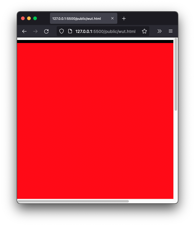
How can I make it so that it is possible to scroll to the left edge of the div?