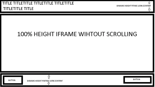
how are you? I hope everyone is fine, today I faced a problem and I can't find a way to make the title and controls have a dynamic height depending on their content when I'm using an iframe in the middle to make it have 100% of its height without making the screen scroll,I will attach an image so that you have an idea of the result I am trying to do and also attach my html code (I am new in stackoverflow please if there is anything you need, tell me thx:) )
<!doctype html>
<html>
  <head>
    <meta charset="utf-8">
    <meta name="viewport" content="width=device-width, initial-scale=1">
    <link href="https://cdn.jsdelivr.net/npm/bootstrap@5.1.3/dist/css/bootstrap.min.css" rel="stylesheet">
    <title>Page 1</title>
    <style>
    .general{
        left:0;
        right:0;
    }
    </style>
  </head>
<body>
<div class="general w-100 h-100 position-fixed bottom-0 top-0">
    <header style="height:auto;">
    <h1>Episode title (some times is big some times is small)</h1>
    </header>

    <main class="h-auto">
    <div class="ratio ratio-16x9 h-100">
    <iframe src="https://www.youtube.com/embed/zpOULjyy-n8?rel=0" frameborder="0" allowfullscreen></iframe>
    </div>
    </main>

    <div style="height:auto;">
    <button>PREV</button>
    <button>LIST</button>
    <button>NEXT</button>
    </div>
</div>
</body>
</html>
