1

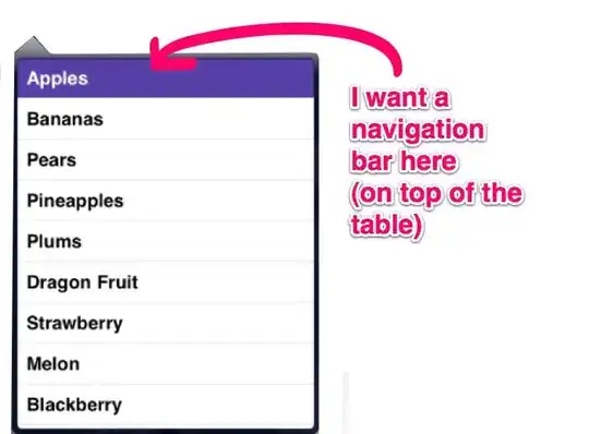
The image speaks for itself: Problem

I want matplotlib to explicitly print the full length y-labels (8 digits total with 6 decimals after the point). But it keeps splitting them into the bias (which can be seen in the top left corner) and the remainder.

I tried disabling the autoscale and setting manual ylims, doesn't help.

Derek O
  • 16,770
  • 4
  • 24
  • 43
  • 1
    if possible, can you include a code snippet so your plot is reproducible? this will help anyone who wants to take a crack at answering your question – Derek O Dec 29 '21 at 23:49

1 Answers1

0

You can retrieve the default y-ticks using plt.gca().get_yticks() and then use plt.gca().set_yticklabels to set them to your desired format (documentation for .set_yticklabels is here and documentation for .gca is here).

import numpy as np
import matplotlib.pyplot as plt
import matplotlib.ticker as mticker

## reproduce your curve
x = np.linspace(31.5,34,500)
y = 3.31*(10**-5)*x**2 - 2.22*(10**-3)*x - 3.68*10**1
plt.scatter(x,y,marker='.')

## retreieve and set yticks
yticks = plt.gca().get_yticks()

plt.gca().yaxis.set_major_locator(mticker.FixedLocator(yticks))
plt.gca().set_yticklabels([f"{y:.6f}" for y in yticks])
plt.show()

enter image description here

Derek O
  • 16,770
  • 4
  • 24
  • 43
  • `plt.gca().ticklabel_format(useOffset=False)`or `plt.gca().yaxis.set_major_formatter(mticker.FormatStrFormatter('%.6f'))` keep working when you zoom in. – JohanC Dec 30 '21 at 00:35