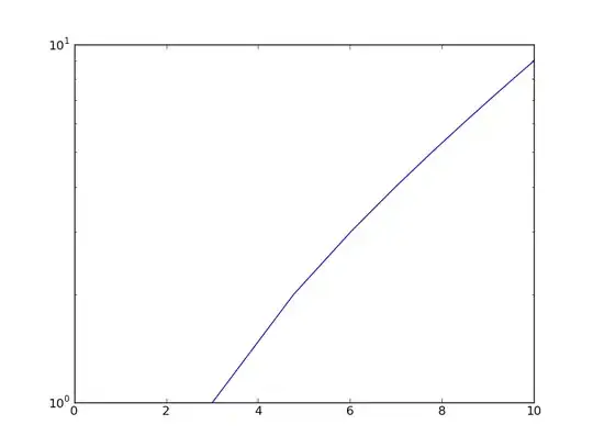
I have a dataframe in R with the following dataset structure (dummy data):
Years    Spain     Russia     Malta
1995     31.3      45         84.3
2009     32.4      4          90
And I want it to be plotted in a bar chart where X is the years and for the year 1995, the values of each country are represented by vertical bars side-by-side, the same for 2009. My code for plotting the data is:
ggplot(data, aes(x = years)) +
  geom_histogram(binwidth=1, position="dodge") +
  theme_minimal()
However my bar chart is being plotted like the image below, 1) where the XX has every year between, 2) no colours to differentiate countries and 3) the 3 countries are obviously not side by side for each year. How can I represent this in R?


