I have been trying many different methods to achieve the following but could not.
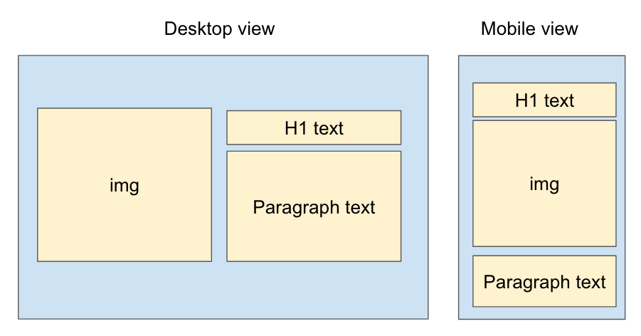
I tried using media query to change the order of the children within the flex box of the div that contains all 3 but it seems like I can only do so when all 3 children are divs. However when all 3 children are divs, I cannot achieve the desktop outcome. Basically the header and the paragraph text will each take a column.
Any help would be greatly appreciated.
Exiting code: https://codepen.io/lionellloh/pen/BawVpjm
<div class="parent">
  <img src="https://upload.wikimedia.org/wikipedia/commons/2/27/Red_square.svg">
  <h1> This is a header </h1>
  <p> This is some body text that is very interesting </p>

 </div>
.parent {
  display: flex;
  flex-wrap: wrap;
}

@media only screen and (max-width: 900px) {
    .parent :nth-child(1) {
        order: 2;
    }

    .parent :nth-child(2) {
        order: 1;
    }

    .parent :nth-child(3) {
        order: 3;
    }
}