For a special project, I need to use a scrollable box that has exactly a height of 100vh respectively 100%.
Basically, it looks like that:
* {
  margin: 0;
  padding: 0;
}

html {
  font-family: Arial;
  font-size: 10vh;
}

html,
body {
  position: fixed;
  width: 100%;
  height: 100%;
}

#content {
  overflow-y: scroll;
  height: 100%;
  width: 100%;
  background-color: red;
}
<div id="content"> Lorem ipsum dolor sit amet, consetetur sadipscing elitr, sed diam nonumy eirmod tempor invidunt ut labore et dolore magna aliquyam erat, sed diam voluptua. At vero eos et accusam et justo duo dolores et ea rebum. Stet clita kasd gubergren, no sea takimata
sanctus est Lorem ipsum dolor sit amet. Lorem ipsum dolor sit amet, consetetur sadipscing elitr, sed diam nonumy eirmod tempor invidunt ut labore et dolore magna aliquyam erat, sed diam voluptua. At vero eos et accusam et justo duo dolores et ea rebum.
Stet clita kasd gubergren, no sea takimata sanctus est Lorem ipsum dolor sit amet. Lorem ipsum dolor sit amet, consetetur sadipscing elitr, sed diam nonumy eirmod tempor invidunt ut labore et dolore magna aliquyam erat, sed diam voluptua. At vero eos
et accusam et justo duo dolores et ea rebum. Stet clita kasd gubergren, no sea takimata sanctus est Lorem ipsum dolor sit amet. Lorem ipsum dolor sit amet, consetetur sadipscing elitr, sed diam nonumy eirmod tempor invidunt ut labore et dolore magna
aliquyam erat, sed diam voluptua. At vero eos et accusam et justo duo dolores et ea rebum. Stet clita kasd gubergren, no sea takimata sanctus est Lorem ipsum dolor sit amet.</div>On my iPhone this is the result:
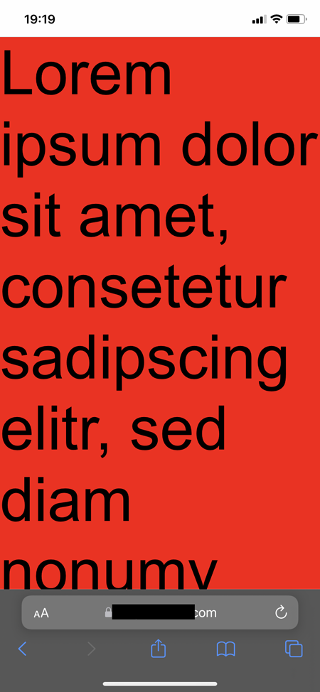
Now, if I start scrolling, the bottom browser bar disappears and creates a white gap:
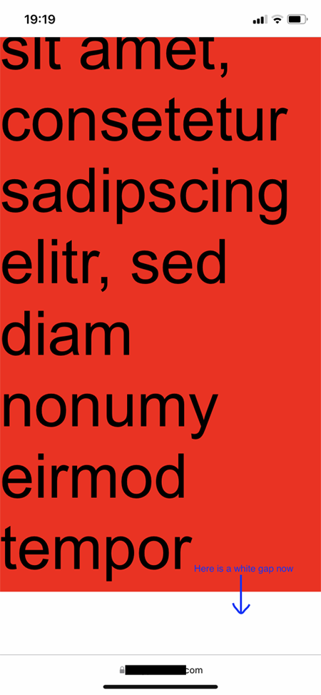
I have already tried to fix it with -webkit-fill-available; and to resize the height to 100% with every touch via JavaScript. Unfortunately, all my tries didn't work.
Basically, the height of the page should be updated if the browser bar disappears. Has someone an idea to fix that?
Would be very thankful for help <3