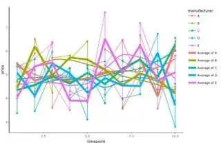
I have made a self-contained script and plot on RPubs to illustrate what I want: https://rpubs.com/cr517/plotly_select_average_line
In Manufacturer E data, I want to have a button to deselect the average line. How can I do that?
Script:
library(data.table)
library(ggplot2)
library(htmlwidgets)
library(plotly)

dir_ticket <- '/Users/biomagician/Documents/sandbox/stackoverflow/'

dir_output <- paste0(dir_ticket, 'output/plot')
if (!file.exists(dir_output)) dir.create(dir_output, recursive = TRUE)

nb_timepoints <- 10
manufacturers <- c('Ferrero', 'Procter and Gamble', 'Nestlé', 'Migros', 'Coop')
nb_manufacturers <- length(manufacturers)
products <- c('chocolate spread', 'crisps')
nb_products <- length(products)

food_prices <- data.table::data.table(timepoint = rep(1:nb_timepoints, each = nb_manufacturers * nb_products), manufacturer = LETTERS[1:nb_manufacturers], product = products, price = rnorm(nb_timepoints * nb_manufacturers * nb_products, 5))

p <- ggplot2::ggplot(food_prices, ggplot2::aes(x = timepoint, y = price, group = manufacturer, col = manufacturer, label = product)) +
  ggplot2::geom_point() +
  ggplot2::geom_line() +
  ggplot2::geom_smooth(se = FALSE) +
  ggplot2::stat_summary(ggplot2::aes(group = manufacturer, colour = manufacturer), fun.y = mean, geom = 'line', size = 2) +
  ggplot2::theme_classic()
pPlotly <- plotly::ggplotly(p)
htmlwidgets::saveWidget(pPlotly, file = paste0(dir_ticket, 'output/plot/learn_plotly.html'))
pPlotly

sessionInfo()
Session info:
R version 4.1.2 (2021-11-01)
Platform: x86_64-apple-darwin17.0 (64-bit)
Running under: macOS Catalina 10.15.7

Matrix products: default
BLAS:   /System/Library/Frameworks/Accelerate.framework/Versions/A/Frameworks/vecLib.framework/Versions/A/libBLAS.dylib
LAPACK: /Library/Frameworks/R.framework/Versions/4.1/Resources/lib/libRlapack.dylib

locale:
[1] en_US.UTF-8/en_US.UTF-8/en_US.UTF-8/C/en_US.UTF-8/en_US.UTF-8

attached base packages:
[1] stats     graphics  grDevices utils     datasets  methods   base

other attached packages:
[1] plotly_4.10.0     htmlwidgets_1.5.4 ggplot2_3.3.5     data.table_1.14.2

loaded via a namespace (and not attached):
 [1] jquerylib_0.1.4   pillar_1.7.0      compiler_4.1.2    tools_4.1.2       digest_0.6.29     evaluate_0.14
 [7] lattice_0.20-45   jsonlite_1.7.3    lifecycle_1.0.1   tibble_3.1.6      gtable_0.3.0      nlme_3.1-153
[13] viridisLite_0.4.0 mgcv_1.8-38       pkgconfig_2.0.3   rlang_1.0.1       Matrix_1.3-4      cli_3.1.1
[19] crosstalk_1.2.0   yaml_2.2.2        xfun_0.29         fastmap_1.1.0     knitr_1.37        withr_2.4.3
[25] dplyr_1.0.7       httr_1.4.2        generics_0.1.2    vctrs_0.3.8       grid_4.1.2        tidyselect_1.1.1
[31] glue_1.6.1        R6_2.5.1          fansi_1.0.2       rmarkdown_2.11    farver_2.1.0      purrr_0.3.4
[37] tidyr_1.2.0       magrittr_2.0.2    scales_1.1.1      ellipsis_0.3.2    htmltools_0.5.2   splines_4.1.2
[43] rsconnect_0.8.25  colorspace_2.0-2  labeling_0.4.2    utf8_1.2.2        lazyeval_0.2.2    munsell_0.5.0
[49] crayon_1.4.2

