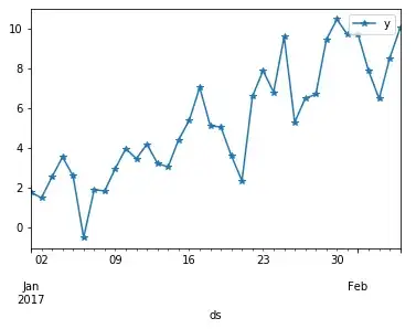
If I plot a time series as a line with plot(), there is no problem:
from pydataset import data
import pandas as pd
import matplotlib.pyplot as plt

economics = data('economics')
economics['date'] = pd.to_datetime(economics.date)

fig, axes = plt.subplots()
axes.plot(economics['date'], economics['unemploy'])
But if I use bar(), the outcome is not what I expect
fig, axes = plt.subplots()
axes.bar(economics['date'], economics['unemploy'])
I get something closer to what I want with pandas' plot.bar():
import matplotlib.ticker as tkr

economics.set_index("date", inplace = True)

ax = economics['unemploy'].plot.bar()

# Display only the year, only for January and only every 5 years
ticklabels = [item.strftime('%Y') if item.month==1 and item.year % 5 ==0 else '' for item in economics.index]
ax.xaxis.set_major_formatter(tkr.FixedFormatter(ticklabels))
But I would like to understand what is wrong with the bars' height in the plot that uses bar()


