What I want to do
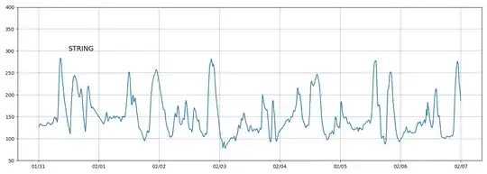
I want to draw a horizontal line in the graph shown below.
Code and its explanation
I have a dataframe df which has two columns. One is the datetime column which contains datatime.datetime type values and another is the bgl column which contains integer values.
I extract data between 2022/1/31 and 2022/2/6 from df and then store it in the dataframe df_x. df_x is converted into a list type and then used to draw a graph. So I think the unit of the x-axis might be datetime.datetime type.
When I use the ax.text() method, I specified the X position to be datetime.datetime type, which is correctly shown in the graph.
Now I want to draw a horizontal line in the graph, so I specified datetime.datetime type values for both xmin and xmax. When I run the code, however, an error has occurred like below:
builtins.ValueError: xmin must be a single scalar value, but got 2022-01-31 00:00:00
So my question is: How should I specify both xmin and xmax to draw a horizontal line?
My full code:
import datetime
import matplotlib.pyplot as plt
import matplotlib.dates as mdates
import pandas as pd

df = pd.DataFrame({"datetime":dt_string,"bgl":valbgl})
df["bgl"] = df["bgl"].astype("int")

df_x = df[(df["datetime"] >= datetime.datetime(2022,1,31,0,0,0))&(df["datetime"] <= datetime.datetime(2022,2,6,23,59,59))]

fig = plt.figure(figsize=(14,5), tight_layout=True)
ax = fig.add_subplot()
ax.set_ylim((50,400))
ax.grid(True)
ax.xaxis.set_major_locator(mdates.DayLocator(bymonthday=None, interval=1, tz=None))
ax.xaxis.set_major_formatter(mdates.DateFormatter("%m/%d"))
ax.text(datetime.datetime(2022,1,31,12,0,0),300,"STRING",fontsize=14)

plt.axhline(xmin=datetime.datetime(2022,1,31,0,0,0),xmax=datetime.datetime(2022,2,6,23,59,59),y=200,color="RED")

ax.plot(df_x["datetime"].tolist(),df_x["bgl"].tolist())
plt.show()
Output:
Environment:
- Windows 10
- Python v3.10.2
- Matplotlib v3.5.1
- Pandas v1.4.0