I'm trying to nest a tabview in a Scrollview, and can't find a good way to accomplish the task.
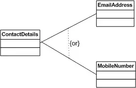
A diagram is included below:
The desired functionality is to have a normal scrollable page, where one of the slivers is a tab view with different sized (and dynamically resizing) tabs.
Unfortunately, despite looking at several resources and the flutter docs, I haven't come across any good solutions.
Here is what I have tried:
SingleChildScrollViewwith a column child, with the TabBarView wrapped in an IntrinsicHeight widget (Unbound constraints)CustomScrollViewvariations, with the TabBarView wrapped in aSliverFillRemainingand the header and footer each wrapped with aSliverToBoxAdapter. In all cases, the content is forced to expand to the full size of the viewport (as if using aSliverFillViewportSliver with a viewport fraction of 1.0) if smaller, or a nested scroll/overflow is created within the space if larger (see below)- If the children of the TabBarView are scrollable widgets, the sliver with the tab bar is given a height equal to the ViewPort (1.0) and any leftover space is empty.
- If the children are not scrollable, they are force-expanded to fit if smaller, or give an overflow error if larger.
NestedScrollViewcomes closest but still suffers the ill effects of the previous implementation (see below for code example)- Various other unorthodox approaches (such as removing the TabBarView and trying to use an
AnimatedSwitcherin conjunction with a listener on the TabBar to animate between the "tabs" but this wasn't swipable and the animation janked and the switched widgets overlapped)
The thus-far "best" implementation's code is given below, but it is not ideal.
Does anyone know of any way(s) to accomplish this?
Thank you in advance.
// best (more "Least-bad") solution code
import 'package:flutter/material.dart';

void main() {
  runApp(const MyApp());
}

class MyApp extends StatelessWidget {
  const MyApp({Key? key}) : super(key: key);

  @override
  Widget build(BuildContext context) {
    return MaterialApp(
      title: 'Demo',
      routes: {
        'root': (context) => const Scaffold(
              body: ExamplePage(),
            ),
      },
      initialRoute: 'root',
    );
  }
}

class ExamplePage extends StatefulWidget {
  const ExamplePage({
    Key? key,
  }) : super(key: key);

  @override
  State<ExamplePage> createState() => _ExamplePageState();
}

class _ExamplePageState extends State<ExamplePage>
    with TickerProviderStateMixin {
  late TabController tabController;

  @override
  void initState() {
    super.initState();
    tabController = TabController(length: 2, vsync: this);
    tabController.addListener(() {
      setState(() {});
    });
  }

  @override
  void dispose() {
    tabController.dispose();
    super.dispose();
  }

  @override
  Widget build(BuildContext context) => Scaffold(
        resizeToAvoidBottomInset: true,
        backgroundColor: Colors.grey[100],
        appBar: AppBar(),
        body: NestedScrollView(
          floatHeaderSlivers: false,
          physics: const AlwaysScrollableScrollPhysics(),
          headerSliverBuilder: (BuildContext context, bool value) => [
            SliverToBoxAdapter(
              child: Padding(
                padding: const EdgeInsets.only(
                  left: 16.0,
                  right: 16.0,
                  bottom: 24.0,
                  top: 32.0,
                ),
                child: Column(
                  children: [
                    // TODO: Add scan tab thing
                    Container(
                      height: 94.0,
                      width: double.infinity,
                      color: Colors.blueGrey,
                      alignment: Alignment.center,
                      child: Text('A widget with information'),
                    ),
                    const SizedBox(height: 24.0),
                    GenaricTabBar(
                      controller: tabController,
                      tabStrings: const [
                        'Tab 1',
                        'Tab 2',
                      ],
                    ),
                  ],
                ),
              ),
            ),
          ],
          body: CustomScrollView(
            slivers: [
              SliverFillRemaining(
                child: TabBarView(
                  physics: const AlwaysScrollableScrollPhysics(),
                  controller: tabController,
                  children: [
                    // Packaging Parts
                    SingleChildScrollView(
                      child: Container(
                        height: 200,
                        color: Colors.black,
                      ),
                    ),
                    // Symbols
                    SingleChildScrollView(
                      child: Column(
                        children: [
                          Container(
                            color: Colors.red,
                            height: 200.0,
                          ),
                          Container(
                            color: Colors.orange,
                            height: 200.0,
                          ),
                          Container(
                            color: Colors.amber,
                            height: 200.0,
                          ),
                          Container(
                            color: Colors.green,
                            height: 200.0,
                          ),
                          Container(
                            color: Colors.blue,
                            height: 200.0,
                          ),
                          Container(
                            color: Colors.purple,
                            height: 200.0,
                          ),
                        ],
                      ),
                    ),
                  ],
                ),
              ),
              SliverToBoxAdapter(
                child: ElevatedButton(
                  child: Text('Button'),
                  onPressed: () => print('pressed'),
                ),
              ),
            ],
          ),
        ),
      );
}

class GenaricTabBar extends StatelessWidget {
  final TabController? controller;
  final List<String> tabStrings;

  const GenaricTabBar({
    Key? key,
    this.controller,
    required this.tabStrings,
  }) : super(key: key);

  @override
  Widget build(BuildContext context) => Container(
        decoration: BoxDecoration(
          color: Colors.grey,
          borderRadius: BorderRadius.circular(8.0),
        ),
        padding: const EdgeInsets.all(4.0),
        child: Column(
          mainAxisSize: MainAxisSize.min,
          children: [
            // if want tab-bar, uncomment
            TabBar(
              controller: controller,
              indicator: ShapeDecoration.fromBoxDecoration(
                BoxDecoration(
                  borderRadius: BorderRadius.circular(6.0),
                  color: Colors.white,
                ),
              ),
              tabs: tabStrings
                  .map((String s) => _GenaricTab(tabString: s))
                  .toList(),
            ),
          ],
        ),
      );
}

class _GenaricTab extends StatelessWidget {
  final String tabString;

  const _GenaricTab({
    Key? key,
    required this.tabString,
  }) : super(key: key);

  @override
  Widget build(BuildContext context) => Container(
        child: Text(
          tabString,
          style: const TextStyle(
            color: Colors.black,
          ),
        ),
        height: 32.0,
        alignment: Alignment.center,
      );
}
The above works in Dartpad (dartpad.dev) and doesn't require any external libraries
