Since 0 has a special meaning for most data, it seems like the main concern is you don't want values close to 0 to be misinterpreted as 0.
You could use a custom tick array and manually pass [0, 10**6, 10**8, 2*10**8, ..., 5*10**8], but this is a brittle solution because you would have to know ahead of time the default tickvalues that plotly will generate when it creates your chart.
To make a solution that's a bit more dynamic, you can use the full figure for development, as this useful answer suggests. You will need to run the following in terminal:
pip install -U kaleido
Then we will use full_fig = fig.full_figure_for_development() which gives you access the range of the tickmarks, the spacing between them, and the location of the first tickmark which is enough information to reproduce the tickmarks. After that you can insert a new tickmark for whatever value you like in this array such as 10**6.
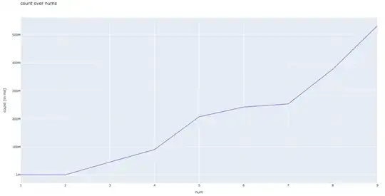
If you want to include the textmark and ticktext for 0, it will overlap with the ticktext for 1M unless you are zoomed in far enough. I chose to remove the tickmark for 0 because it's hard to figure out where you would place the tick text for 0 so that it doesn't overlap with the tick text for 1M (but both possibilities are shown in the attached images)
import numpy as np
import plotly.express as px
import plotly.graph_objects as go

count = {
    '1': 1040513,
    '2': 1043584,
    '3': 46559347,
    '4': 91046152,
    '5': 207986283,
    '6': 242763604,
    '7': 253851018,
    '8': 377742455,
    '9': 532537482
}

fig = px.line(x=count.keys(), y=count.values(),
             labels={'x': 'num', 'y': 'count (in mil)'},
             title='count over nums')

## reproduce the ytick array using the full figure for development
## reference: https://stackoverflow.com/questions/62030735/how-to-obtain-generated-x-axis-and-y-axis-range-in-plotly-plot
full_fig = fig.full_figure_for_development()
y_min, y_max = full_fig.layout['yaxis']['range']
y_first_tick = full_fig.layout['yaxis']['tick0']
y_dtick = full_fig.layout['yaxis']['dtick']
y_tick_array = np.arange(y_first_tick,y_max,y_dtick)

## include the tickmark for 0
# y_tick_vals = y_tick_array.tolist() + [10**6]

## remove the tickmark for 0
y_tick_vals = y_tick_array[1:].tolist() + [10**6]
y_tick_vals.sort()

fig.update_layout(
    yaxis = dict(
        tickmode = 'array',
        tickvals = y_tick_vals,
    )
)

fig.show()
If you remove the tickmark for 0, it will look like this:
And if you include the tickmark for 0, it will look like this: