1

My goal is to build a circular progress indicator.

I have come across library daisyui and its radial progress component - https://daisyui.com/components/radial-progress/

it says: "Radial progress needs --value CSS variable to work."

I have tried doing this:

      <div className="radial-progress" style={{ "--value": 70 }}>
        70%
      </div>

But, it's not working, am I doing something wrong?

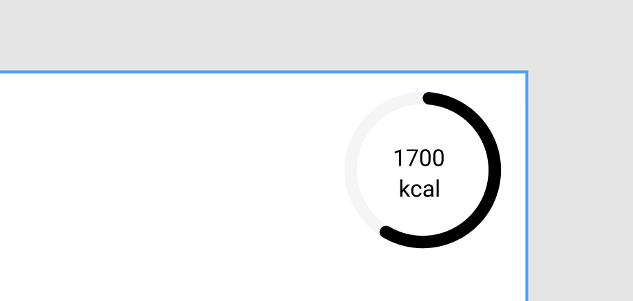
This is what I want to achieve:

enter image description here

this is the codesandbox link: https://codesandbox.io/s/react-tailwind-playground-forked-9jwc49?file=/src/App.tsx

Ripas55
  • 423
  • 1
  • 6
  • 20

3 Answers3

1

This worked for me.

const style = { "--value": 70 } as React.CSSProperties

<div className="radial-progress" style={style}>
  70%
</div>

0

We package called react-circular-progressbar in react js we can use this to achieve your requirements.

(or)

we have multiple packages are there for circular progress bar you can choose which one is suited for you.

nagendra nag
  • 1,142
  • 2
  • 15
0

I recently came across this issue with typescript. I just added a global.d.ts file to the root folder of my project and use module augmentation to fix the issue

//global.d.ts
import React from "react";

declare module "react" {
  interface CSSProperties {
    "--value"?: string | number;
    "--size"?: string | number;
    "--thickness"?: string | number;
  }
}

jmarioste
  • 768
  • 7
  • 8