0

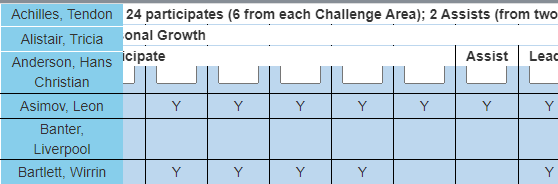
I have a large table that is scrolling on the horizontal and vertical with the first column sticky and the three header rows sticky. This works to a point. However the table extends past the right side of the screen.

enter image description here

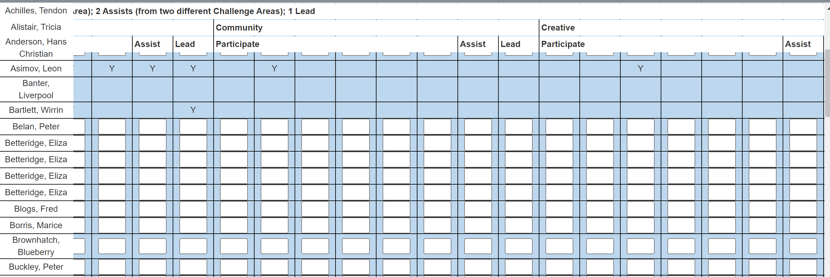
I would like it to remain in the boundaries of the screen. From the image you can see I have two issues:

  1. The table extends past the end of the screen on the right
  2. The Name heading is behind the list of names when scrolled (this does not happen in the attached jfiddle)

When I add this css:

table {
    display: block;
    overflow: scroll;
}

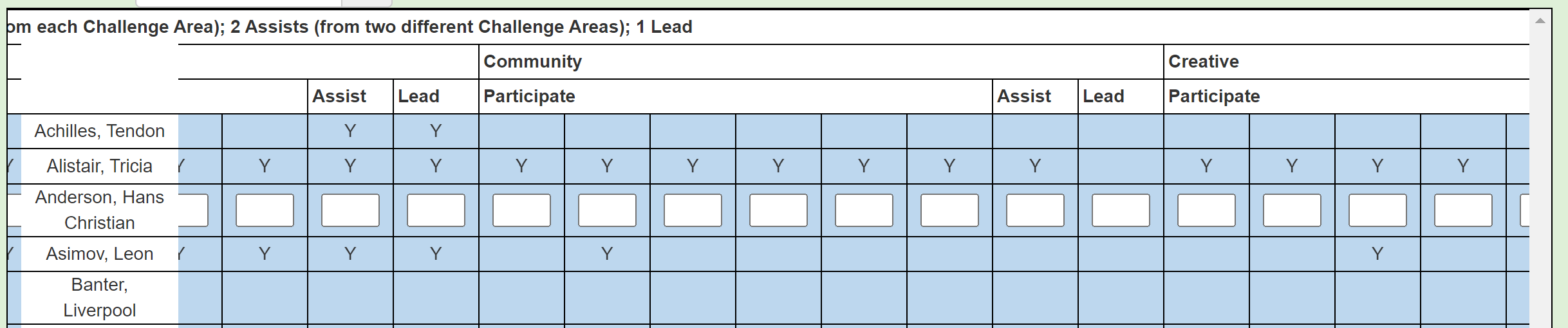
The table is within the boundary of the screen; however the sticky on the heading rows does not work. The left column sticky is also not as good (please see the image).

enter image description here

Please see my attempt at a jfiddle; however, I can not get the Bootstrap to work (I included the cdns).

https://jsfiddle.net/Glyndwr/2tfLu87a/11/

My aim is to have the:

  1. Table stay within the boundaries of the screen
  2. Top heading rows and left column stick when I scroll
  3. Name heading remain in front when I scroll

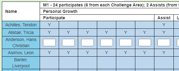
A bit more of an explanation relating to making the "Name" cell in the top right corner sticky. This is the starting position:

enter image description here

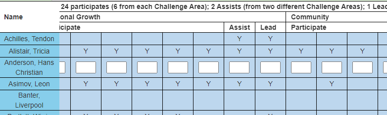
When I scroll right the "Name" column is in front, which is correct:

enter image description here

However, when I scroll down the "Name" cell does not stick:

enter image description here

So what I need is for the "Name" cell to stick on both scroll right and down.

Glyn
  • 1,933
  • 5
  • 37
  • 60

2 Answers2

0

You can set/make the thead itself sticky instead of individual rows/trs. As for the names in the row, since they're first-child of each tbody's trs you can select them and apply styles, like so:

tbody>tr>td:first-child{
  background: red;
  position: sticky;
  left: 0;
}

You can then wrap the table inside a block container to give it vertical and horizontal scrolling. See the CSS example below:

.table-wrapper{
  margin: 0 auto;
  display: block;
  width: 98vw;
  height: 95vh;
  overflow: auto;
  border: 1px solid black;
}

I've edited your jsfiddle here.

Yong
  • 1,622
  • 1
  • 4
  • 29
  • Hi Yong, thank you for your help. I added your code. When I scroll down the Name cell does not stick (it does stick when I scroll right). Also, the table still extends pas the right of the screen. – Glyn Feb 18 '22 at 00:11
  • 1
    According to [Table overflowing outside of div](https://stackoverflow.com/questions/2259189/table-overflowing-outside-of-div) post, html tables can't really do that normally like any other container, forcing it to not overflow in your case would make it look like [this](https://jsfiddle.net/m169xukj/). For the Name cell not being vertically sticky, don't you need that cell to align to the row for its other values? – Yong Feb 18 '22 at 00:43
  • Thank you Yong, so no luck on forcing the table onto the page. In relation to the "Name" cell I have added further information to my original post. What I want is for the "Name" cell to stick on scroll right and down. – Glyn Feb 18 '22 at 22:46
  • 1
    It would be more appropriate to restructure your HTML if that's the case. If you want to push through with what you have you can use `fixed` position to the names to make it fixed, whichever direction you scroll(I don't get why you would want this honestly). The problem with this is that it won't align perfectly with the data you have on your table. [Here's](https://jsfiddle.net/0mq1xhoa/) a jsfiddle for that. – Yong Feb 19 '22 at 00:45
  • Hi Yong, that did not work very well, as you suspected. However, I have found a good example of what I am trying to achieve at https://css-tricks.com/a-table-with-both-a-sticky-header-and-a-sticky-first-column/. However, I can not get it to work in my scenario. – Glyn Feb 19 '22 at 05:13
  • Hi Yong, I found the answer to the "Name" cell issue. That just leave my main issue of keeping the table within the screen. – Glyn Feb 19 '22 at 05:38
  • 1
    How about wrapping the table inside a block container and enable scrolling for the overflow in there instead? I've edited the snippet in my answer. See if it fits your requirements. – Yong Feb 25 '22 at 06:39
  • 1
    Hi Yong, thank you so much. I have already tried this and it stopped the sticky from working. However, I tried yours and it works! I will now compare your approach to mine to see where I went wrong. Thank you so much! – Glyn Feb 25 '22 at 22:39
0

A partial answer. Still need to figure out how to fix my main issue of keeping the table within the screen. Answer to the "Name" cell issue is partly answered by @Yong.

Replace:

table thead tr.first th {
    padding: 3px;
    position: -webkit-sticky;
    position: sticky;
    top: 0;
    z-index: 1;
    background: white;
}

table thead tr.second th {
    padding: 3px;
    position: -webkit-sticky;
    position: sticky;
    z-index: 1;
    background: white;
}

table thead tr.third th {
    padding: 3px;
    position: -webkit-sticky;
    position: sticky;
    z-index: 1;
    background: white;
}

With Yong's code (I came up with replacing z-index: 1 with z-index-3):

thead {
    position: -webkit-sticky;
    position: sticky;
    top: 0;
    z-index: 3;/*replace 1 with 3 */
    background: white;
    border: 1px solid black;
}

This also makes the code a lot simpler. We could also replace the original code's z-index: 1 with z-index-3.

Glyn
  • 1,933
  • 5
  • 37
  • 60