I ran the codes as below:
ggplot(data, aes(fill=bolumtam, y=Languagevalue/tapply(Languagevalue, Language ,sum)[Language], x=Language)) +
    geom_bar(aes( y=Languagevalue/tapply(Languagevalue, Language ,sum)[Language]), position="dodge", stat="identity")+
 geom_text(aes( y=Languagevalue/tapply(Languagevalue, Language ,sum)[Language], label=scales::percent(Languagevalue/tapply(Languagevalue, Language ,sum)[Language]) ),
            stat="identity", position=position_dodge(0.9), vjust=-0.5)+
 scale_y_continuous(labels = scales::percent)
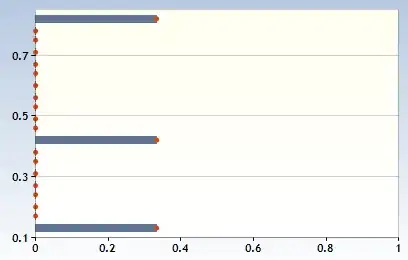
produces:

but I want to produce a graph with patterns and percent labels similar to this:

Some fake random data:
set.seed(100)
Language <- sample(c("Language 1", "Language 2", "Language 3", "Language 4"), 100, TRUE)
bolumtam <- sample(c("Associate", "Natural Sciences", "Social Sciences"), 100, TRUE)
Languagevalue <- sample(c(0, 1, 2, 3, 4, 5), 100, TRUE)

data <- data.frame(Language, bolumtam, Languagevalue)