1

Let's suppose this is my dataset:

set.seed(21022022)
TablaStack <- data.frame(
  n <- rbinom(12, 1000, 0.5),
  T1 <- rnorm(12, 300, 50),
  T2 <- rnorm(12, 500, 60),
  T3 <- rnorm(12, 650, 90),
  T4 <- rt(12, 500, 600),
  Variable <- rep(c("A", "B", "C", "D", "E", "F"), 2),
  Group <- c(rep(c("G1"),6),rep(c("G2"),6))
)
colnames(TablaStack) = c("Cases", "T1", "T2", "T3", "T4", "Variable", "Group")
Treatments <- c("Cases", "T1", "T2", "T3", "T4")

My intention is to show the two values (group 1 and 2) of the variables for each treatment with a dropdown menu just like this. This is the code of my visualization, it's an adaptation of this answer:

create_buttons <- function(df, y_axis_var_names) {
  lapply(
    y_axis_var_names,
    FUN = function(var_name, df) {
      button <- list(
        method = 'restyle',
        args = list('y', list(df[, var_name])),
        label = sprintf('%s', var_name)
      )
    },
    df
  )
}


plot_ly(
  TablaStack, 
  x = ~Variable, 
  y = ~Cases,
  color = ~as.factor(Group),
  colors = "Set2",
  type = "bar") %>%
  layout(
    yaxis = list(title = "y"),
    updatemenus = list(
      list(
        y = 0.7,
        buttons = create_buttons(TablaStack, 
                                 Treatments)
      )))

My problem it's when I select a treatment, it doesn't show the values for group 2. I don't understand why this happens.
camille
  • 16,432
  • 18
  • 38
  • 60

1 Answers1

0

I did get it working, but not with your call to lapply. There have been a lot of people who have had this same question go unanswered. That really surprised me. However, after having worked on it for a while, I guess I can see why.

When you group elements in plotly, it doesn't save the grouping as a function like ggplot. So when you build the plot, Cases for example is actually two subplots, not one. Your update was telling both subplots to be updated to the same content. I tried to add a second args to see if it would work, but it didn't. Instead, I've added the expectations to layout.

Since you would have to disinherit the data, re-group and re-subplot with the method you were using, I switched it to a visibility thing. (This is easier to troubleshoot, as well.)

When you look at the string of true and false, think of it as one for each group of each trace. For example, the first two are Cases G1 and Cases G2.

plot_ly(TablaStack, x = ~Variable, 
        color = ~Group, colors = "Set2") %>%
  add_trace(y = ~Cases, type = "bar", visible = T) %>% 
  add_trace(y = ~T1, type = "bar", visible = F) %>%  # add all traces invisible
  add_trace(y = ~T2, type = "bar", visible = F) %>% 
  add_trace(y = ~T3, type = "bar", visible = F) %>% 
  add_trace(y = ~T4, type = "bar", visible = F) %>% 
  layout(
    yaxis = list(title = "y"),
    updatemenus = list(
      list(
        active = 0,
        y = 0.7,
        buttons = list(
          list(
            method = 'restyle', # update so only Cases is shown
            args = list('visible', list(T, T, F, F, F, F, F, F, F, F)),
            label = "Cases"
          ),
          list(
            method = 'restyle', # update so only T1 is shown
            args = list('visible', list(F, F, T, T, F, F, F, F, F, F)),
            label = "T1"
          ),
          list(
            method = 'restyle', # update so only T2 is shown
            args = list('visible', list(F, F, F, F, T, T, F, F, F, F)),
            label = "T2"
          ),
          list(
            method = 'restyle', # update so only T3 is shown
            args = list('visible', list(F, F, F, F, F, F, T, T, F, F)),
            label = "T3"
          ),
          list(
            method = 'restyle', # update so only T4 is shown
            args = list('visible', list(F, F, F, F, F, F, F, F, T, T)),
            label = "T4"
          )) # end buttons list
      )) # end updatemenus list list
    ) # end layout

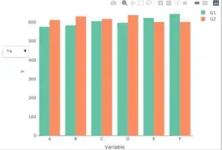
I added images of T2 and T4, so you can see their output.

T2 T4

Kat
  • 15,669
  • 3
  • 18
  • 51