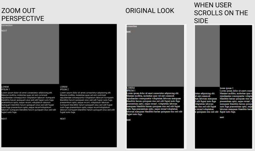
I am working on some website that is designed for users to move from section to section horizontally and vertically. So user needs to be able to click on the footer button on every section and it send him to next section which is on the right side from current section, for footer button on that section user should go to the next section which is down, after that left, down and so on. On the first image you can see how website look like from zoom out perspective. On second image how the website should look like on mobile device and on third what happened when user scrolls on the side with his fingers.
Problem is that I want to disable user to scroll the website horizontally by himself. With 'overflow:hidden' it works for desktop size (if I try to move on the side with keyboard arrows it will not scroll and that's good), only need to implement this method for mobile devices.
Image of the website:
* {
  margin: 0;
  box-sizing: border-box;
}

body {
  background-color: black !important;
  color: #fff !important;
  overflow-y: hidden;
  overflow-x: hidden;
}

.connection {
  display: flex;
  width: 200%;
}

.home {
  height: 50vh;
  background: rgb(109, 106, 106);
}

a {
  color: white !important;
}
<div id="first" class="home">
<p>coonection</p>
<br>
<a href="#second">next</a>
</div>
<div class="connection">
<!-- VALUES 5 -->
<div id="second" class="internal">
<div class="purp">
<p class="rowText">SECTION 1</p>
<p>Lorem ipsum dolor sit amet consectetur adipisicing elit. Maxime mollitia, molestiae quas vel sint commodi repudiandae consequuntur voluptatum laborum numquam blanditiis harum quisquam eius sed odit fugiat iusto fuga praesentium optio, eaque rerum!,
voluptatum laborum numquam blanditiis harum quisquam eius sed odit fugiat iusto fuga praesentium optio, eaque rerum!voluptatum laborum numquam blanditiis harum quisquam eius sed odit fugiat iusto fuga.</p>
<br>
<a href="#third">next</a>
</div>
</div>
<div id="third" class="internal">
<div class="purp">
<p class="rowText">SECTION 2</p>
<p>Lorem ipsum dolor sit amet consectetur adipisicing elit. Maxime mollitia, molestiae quas vel sint commodi repudiandae consequuntur voluptatum laborum numquam blanditiis harum quisquam eius sed odit fugiat iusto fuga praesentium optio, eaque rerum!,
voluptatum laborum numquam blanditiis harum quisquam eius sed odit fugiat iusto fuga praesentium optio, eaque rerum!voluptatum laborum numquam blanditiis harum quisquam eius sed odit fugiat iusto fuga.</p>
<br>
<a>next</a>
</div>
</div>
</div>