0

I have a dataframe data_gender:

gender math_score reading_score writing_score avg_score
female 63.63 72.61 72.47 69.57
male 68.73 65.47 63.31 65.84

and I want to make a seaborn barplot that looks like this plot that I made with matplotlib with simple line

data_gender.plot.bar(figsize=(8,6))
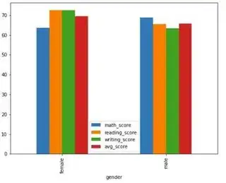
matplotlib bar plot

How would one do it with seaborn?

mozway
  • 194,879
  • 13
  • 39
  • 75
DTvaska
  • 11
  • 1
  • 4

2 Answers2

1

You can reshape with melt and pass the data to sns.barplot:

sns.barplot(data=data_gender.melt(id_vars='gender',
                                  value_name='score', var_name='course'),
            x='gender', y='score', hue='course')

output:

enter image description here

mozway
  • 194,879
  • 13
  • 39
  • 75
-1

sns.barplot(x='gender', y='score', hue='course', data=data_gender)

  • 4
    As it’s currently written, your answer is unclear. Please [edit] to add additional details that will help others understand how this addresses the question asked. You can find more information on how to write good answers [in the help center](/help/how-to-answer). – Community Mar 03 '22 at 15:28