I have a website with a full viewport image like so
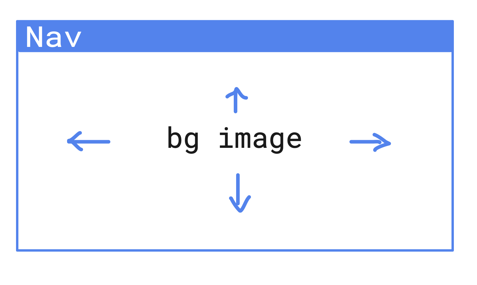
The background image takes up the entire container beneath the Nav Bar.
I want to make it so that on mobile, when I view the image, it's zoomed in/centered such that the image isn't distorted and I'm still able to see some of it as a background... I'm probably not explaining it properly, I'm not fluent in design, but I think this mockup speaks for itself

The red shows the original image boundary, and the blue is the mobile viewport. I want the image to be "cropped"/zoomed on mobile. How do I do this with CSS? Thanks
Edit: To clarify what I've tried, I don't believe I can use background-size: cover and background-position: center. My current setup is with a React Bootstrap Carousel. The Carousel component takes an <img> attribute, so I'm trying to modify the styling of the image. From what I've read, the background-size/position attribute only apply to the <html> tag's style, and it doesn't work based on my experience with attempting this suggestion.
For example, in my homepage.scss I have the following
.fullImage {
    background-position: center;
    background-size: cover;
}
And I apply it to the image in the Carousel
<Carousel.Item interval={5000}>
  <img
    className="fullImage"
    src="/images/home/banner/img1.jpg"
  />
</Carousel.Item>
Only for the effect on Mobile to look something like this:

where the intended effect is supposed to be something like the middle image, where the image isn't actually scrollable outside of the viewport and instead has a fixed size and "zoomed-in" view on a smaller screen.