With plotly.net, I can make a candlestick chart:
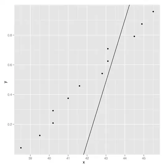
But when I start to plot the price on the same chart, it doesn't work very well:
We can see that each candle should be twice as wide and they should touch each other in order to overlap the time area they represent. It's possible that it will make the chart unreadable, or "ugly", but I'd like to know how this can be achieved to see what it looks like.
Right now the mismatch between the price and candles looks very odd to me; I'd like the candle left and right to align properly with the time they represent.

