The data are a series of dates and times.
date time
2010-01-01 09:04:43
2010-01-01 10:53:59
2010-01-01 10:57:18
2010-01-01 10:59:30
2010-01-01 11:00:44
…
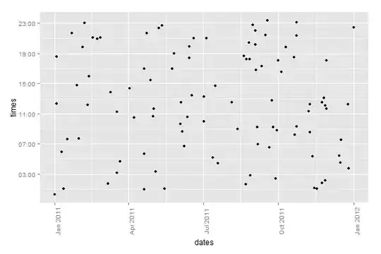
My goal was to represent a scatterplot with the date on the horizontal axis (x) and the time on the vertical axis (y). I guess I could also add a color intensity if there are more than one time for the same date.
It was quite easy to create an histogram of dates.
mydata <- read.table("mydata.txt", header=TRUE, sep=" ")
mydatahist <- hist(as.Date(mydata$day), breaks = "weeks", freq=TRUE, plot=FALSE)
barplot(mydatahist$counts, border=NA, col="#ccaaaa")
- I haven't figured out yet how to create a scatterplot where the axis are date and/or time.
- I would like also to be able to have axis not necessary with linear dates YYYY-MM-DD, but also based on months such as MM-DD (so different years accumulate), or even with a rotation on weeks.
Any help, RTFM URI slapping or hints is welcome.