I've got a simple page in Bootstrap 5. There are multiple sections with different background colours, and I've got a couple of images of a ragged edge to create an irregular border between some of the sections:
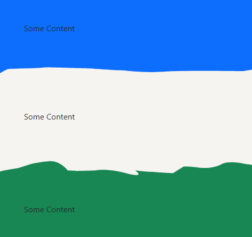
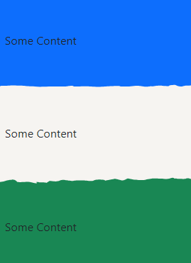
The top image is actually within the blue section and the bottom image is within the green section but because there's no gap it looks like it's all part of the middle section. It works fine at desktop resolutions, but if you reduce it down to a mobile resolution, the browser adds a gap between the image and the edge of the section:

I don't think it's anything to do with the images being SVGs, because I converted them to PNGs and it still does the same thing. I've done the SVGs inline in the example but on the actual page they're external files. I've F12'd it and I can't see any padding or margins that would account for it.
Any ideas?
<!doctype html>
<html lang="en">
  <head>
    <meta charset="utf-8">
    <meta name="viewport" content="width=device-width, initial-scale=1">
    <link href="https://cdn.jsdelivr.net/npm/bootstrap@5.1.3/dist/css/bootstrap.min.css" rel="stylesheet" integrity="sha384-1BmE4kWBq78iYhFldvKuhfTAU6auU8tT94WrHftjDbrCEXSU1oBoqyl2QvZ6jIW3" crossorigin="anonymous">
    <title>Test</title>
  </head>
  <body>
    <div class="container-fluid bg-primary px-0">
      <div class="container">
        <p class="py-5 mb-0">Some Content</p>
      </div>
      <svg version="1.1" id="Layer_1" xmlns="http://www.w3.org/2000/svg" xmlns:xlink="http://www.w3.org/1999/xlink" x="0px" y="0px" viewBox="0 0 1491 57.8" style="enable-background:new 0 0 1491 57.8;" xml:space="preserve">
        <style type="text/css">.st0 { fill: #F6F4F1; }</style>
        <path class="st0" d="M-1.2,64c0-23,0-37.2,0-36.5c0,20.9,22.8-6,36.6-6s19.8-1,39.6-1s32.7-2,37.7-2s78.3,2,84.2,2s55.5,4,67.4,4 s42.6,6,90.2,3s166.4-1,166.4-1s46.6-9,54.5-3s48.5,1,76.3,1s27.7-1,58.5,2s78.3,3,101,0s66.4-3,66.4-3s45.6-2,50.5,1s55.5,3,78.3,0 c22.8-3,51.5-5,61.4-3s59.4,9,68.4,6s42.6-2,48.6-4s49.5-4,58.4-3s48.6,3,48.6,3s5.9-8,22.8-8c16.8,0,23.8-2,29.7,0s21.8,11,37.7,11 s22.8-6,30.7-6s24.8-1,47.6-2s31-1.1,31-1.1l0.2,47C1491.3,63-1.2,62.6-1.2,64z"/>
      </svg>
    </div>
    <div class="container-fluid px-0" style="background-color: #F6F4F1;">
      <div class="container">
        <p class="py-5 mb-0">Some Content</p>
      </div>
    </div>
    <div class="container-fluid bg-success px-0">
      <svg version="1.1" id="Layer_1" xmlns="http://www.w3.org/2000/svg" xmlns:xlink="http://www.w3.org/1999/xlink" x="0px" y="0px" viewBox="0 0 1491 66.8" style="enable-background:new 0 0 1491 66.8;" xml:space="preserve">
        <style type="text/css">.st0 { fill: #F6F4F1; }</style>
        <path class="st0" d="M1492.2-0.5V16l-27.7,11l-17.8-6c0,0-15.8-3-24.8,1s-38.6,2-51.5,2s-36.7-3-36.7-3s-4-12-28.7-2s-73.3,3-77.3,3 s-56.5-1-56.5-1s-46.6,7-56.5,11s-82.2-2-82.2-2l-45.6-9c0,0-8.9,2-18.8,8s-29.7,8-34.7,6s-40.6-11-44.6-11s-69.3,14-73.3,14 s6.9-7-30.7-8s-47.5,5-60.4,9s-68.4-3-72.3-3s-68.4-1-74.3,3s-55.5-4-55.5-4s-30.7-7-45.6,1s-31.7,9-48.5,7c-16.8-2-30.7-2-30.7-2 l-22.8,14c0,0-40.6-3-45.6-3s-32.7-3-32.7-3s24.8,17-17.8,6s-64.4-6-64.4-6s-34.7,1-38.6,1s-19.8-1-19.8-1s-15.9-21-39.6-19 s-37.7,6-37.7,6l-25.8,8L23,49l-23.8,6c0,0,0-23.1,0-57.5C-0.8-2.5,1491.7-0.5,1492.2-0.5z"/>
      </svg>
      <div class="container">
        <p class="py-5 mb-0">Some Content</p>
      </div>
    </div>
    <script src="https://cdn.jsdelivr.net/npm/bootstrap@5.1.3/dist/js/bootstrap.bundle.min.js" integrity="sha384-ka7Sk0Gln4gmtz2MlQnikT1wXgYsOg+OMhuP+IlRH9sENBO0LRn5q+8nbTov4+1p" crossorigin="anonymous"></script>
  </body>
</html>